Artiz.
Art
in the details.
Identity for a door manufacturer: from the geometry of the mark to packaging, communications and spatial design.
2019 · Brand concept · Identity · Brand applications

Manufacturing
with a face of its own.
Artiz makes doors for developers, dealers and trading companies. Alongside standard production, the factory handles bespoke orders and private labels.
The task was to bring disparate materials together into a recognisable identity, communicating the manufacturer’s reliability and attention to design and detail.
Brand character
built into the mark.
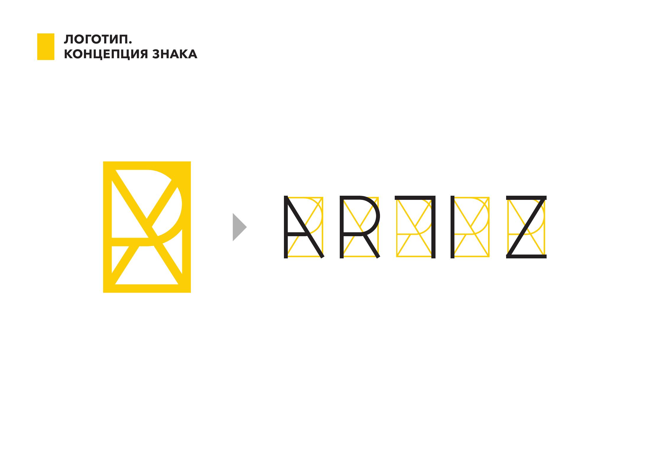
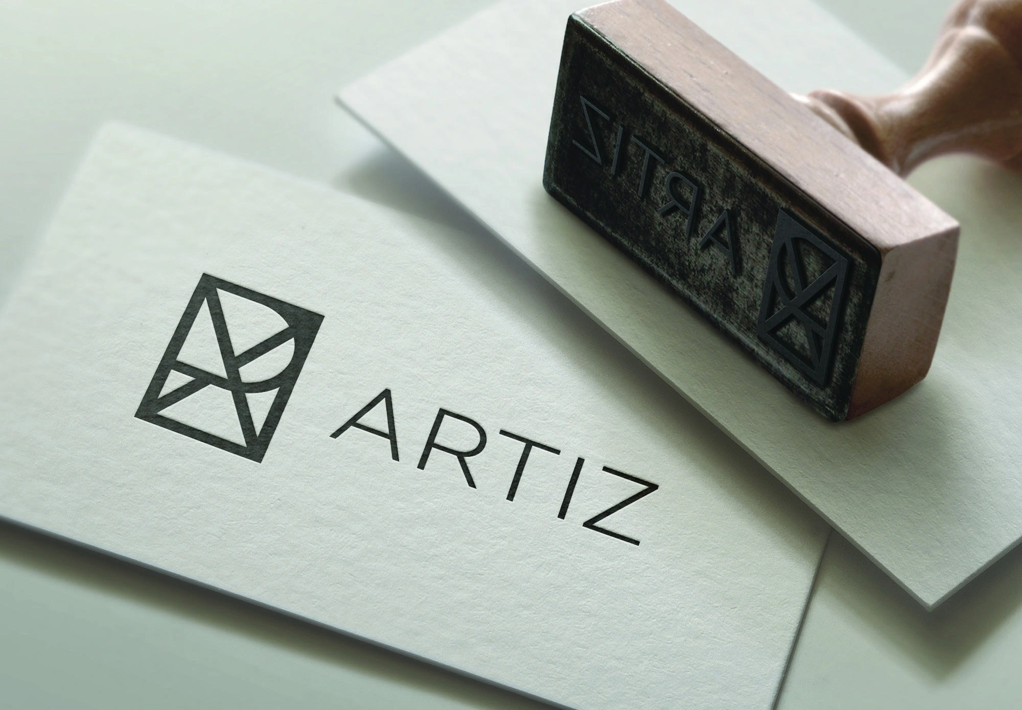
The geometry of the letters ARTIZ forms the basis of the symbol. They combine into a rectangular structure whose proportions echo a door panel.
The symbol works alone or with the name. Its lines extend into a signature pattern, from business cards to packaging and spaces.
Visual language
Clear geometry.
A distinctive accent.
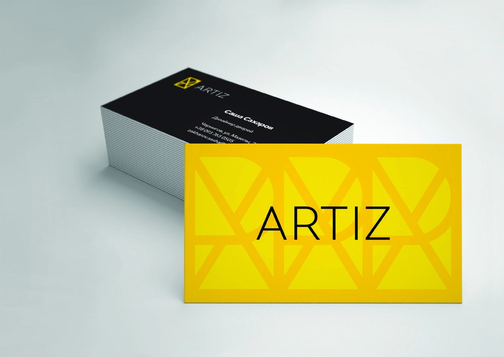
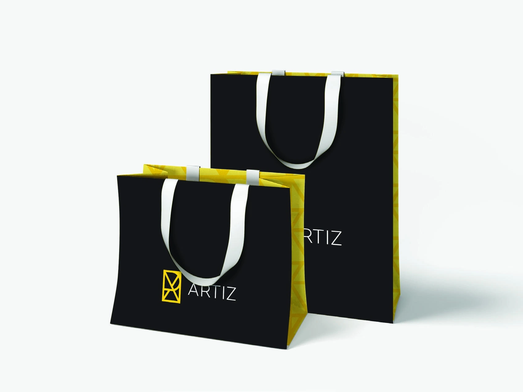
Sunshine yellow makes the brand stand out. Black provides contrast, while restrained typography lets the mark and product take the lead.

At every stage
of discovering the brand.
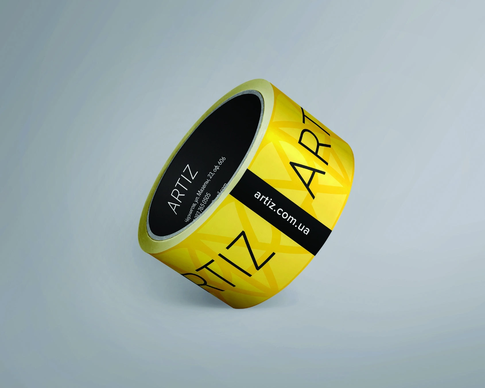
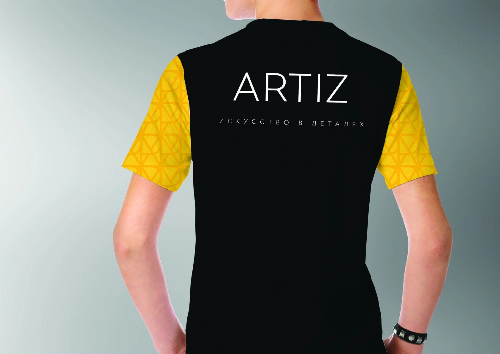
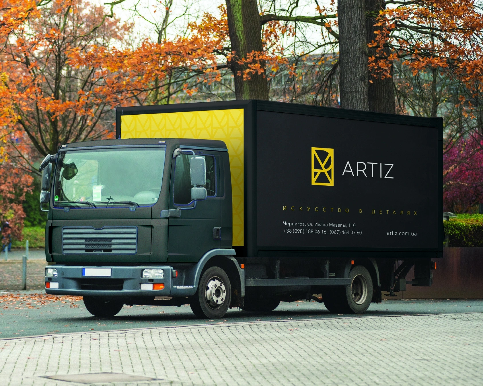
We developed the identity for the manufacturer’s touchpoints: business materials, packaging, team clothing and vehicles. A shared set of elements connects them.
A large mark and yellow accent work on broad surfaces. Smaller applications use a compact logo, the pattern and a clear information hierarchy.

From artwork
to physical materials.
Logo, colour, type and pattern principles were compiled in a logo guide, giving the team a common foundation for future materials.
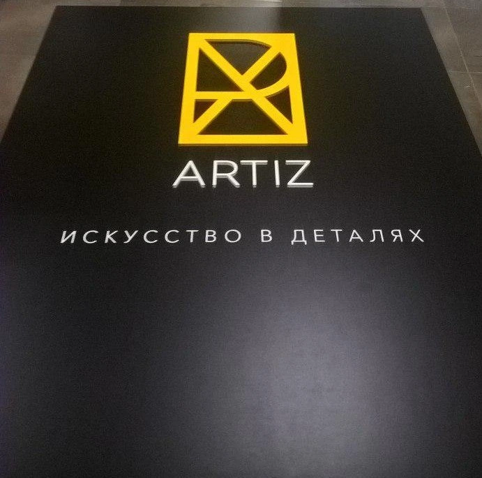
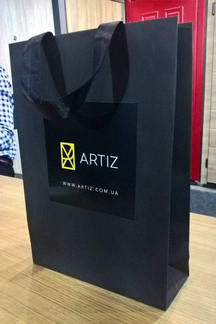
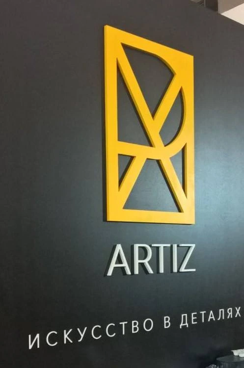
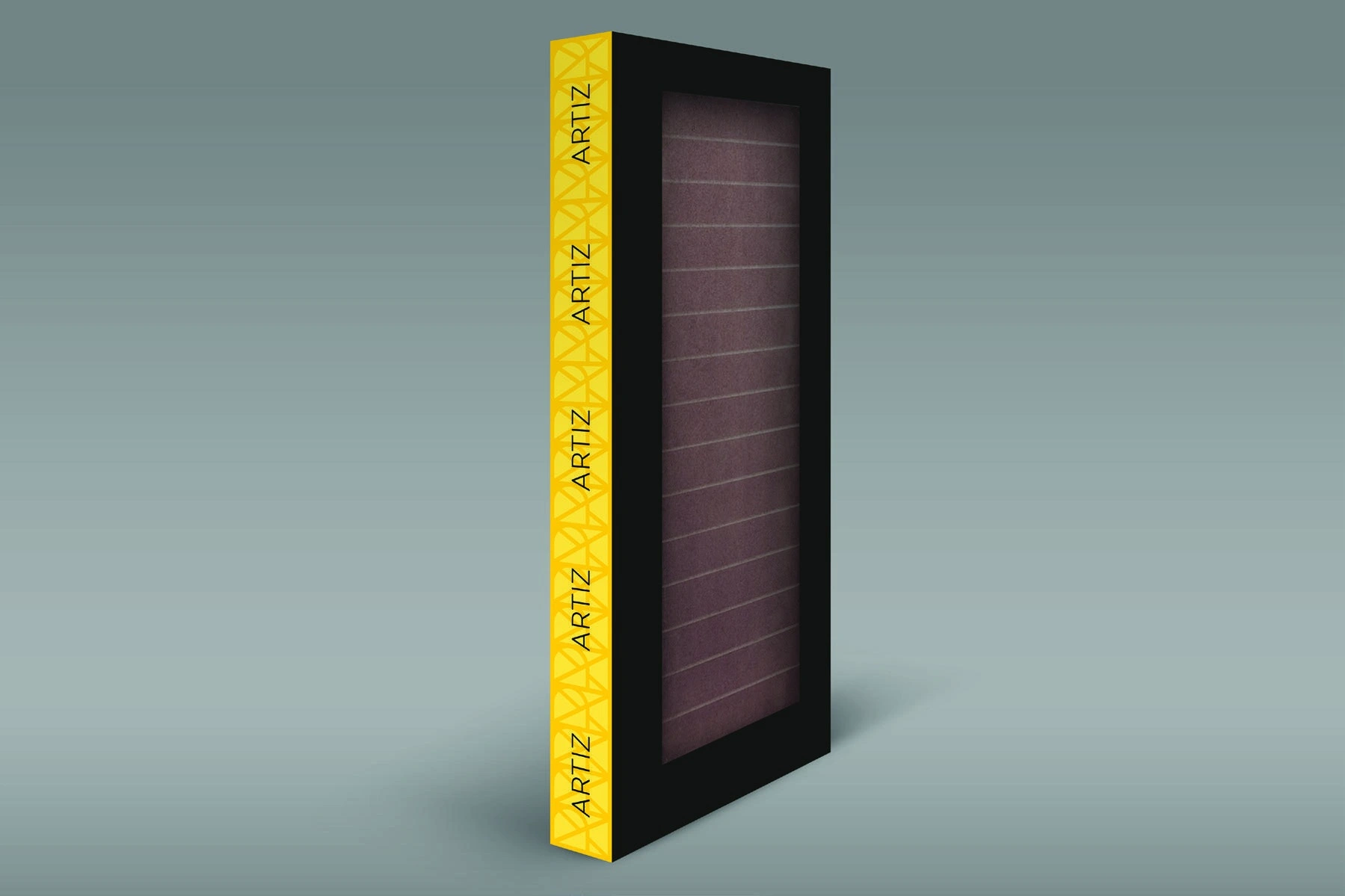
We also prepared applications for exhibition presentations. Below are photographs of produced materials from the project archive.