Breezy.
A second life.
An easy choice.
Identity and communications for a technology reuse brand. The idea of extending a device’s life, expressed through words, graphics and packaging.
Brand concept · Identity · Packaging · Communications
Changing perceptions
of reuse.
Technology given a second life needs a clear, appealing identity. Communications should help people see the potential in a device that has been used before.
We articulated the brand idea through Reuse Easy: reuse should be simple. This message shaped the visual system and tone of communications.
The core device
Extending lives.
Extending letters.
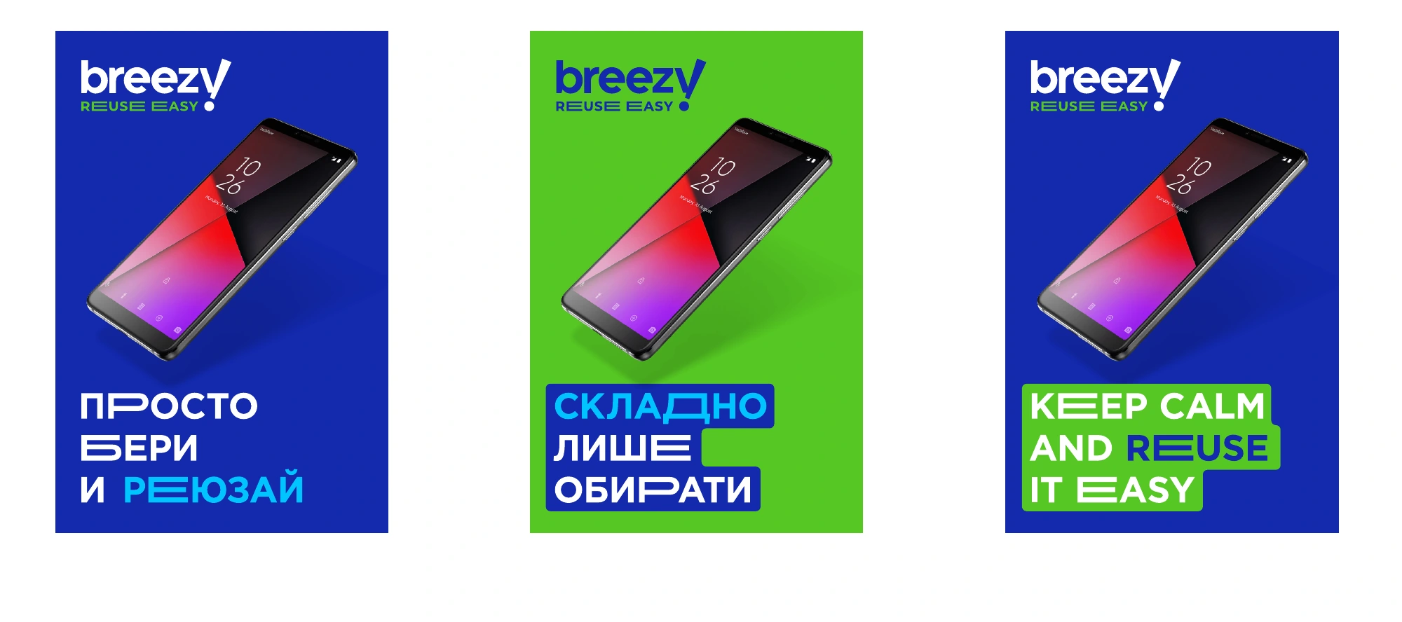
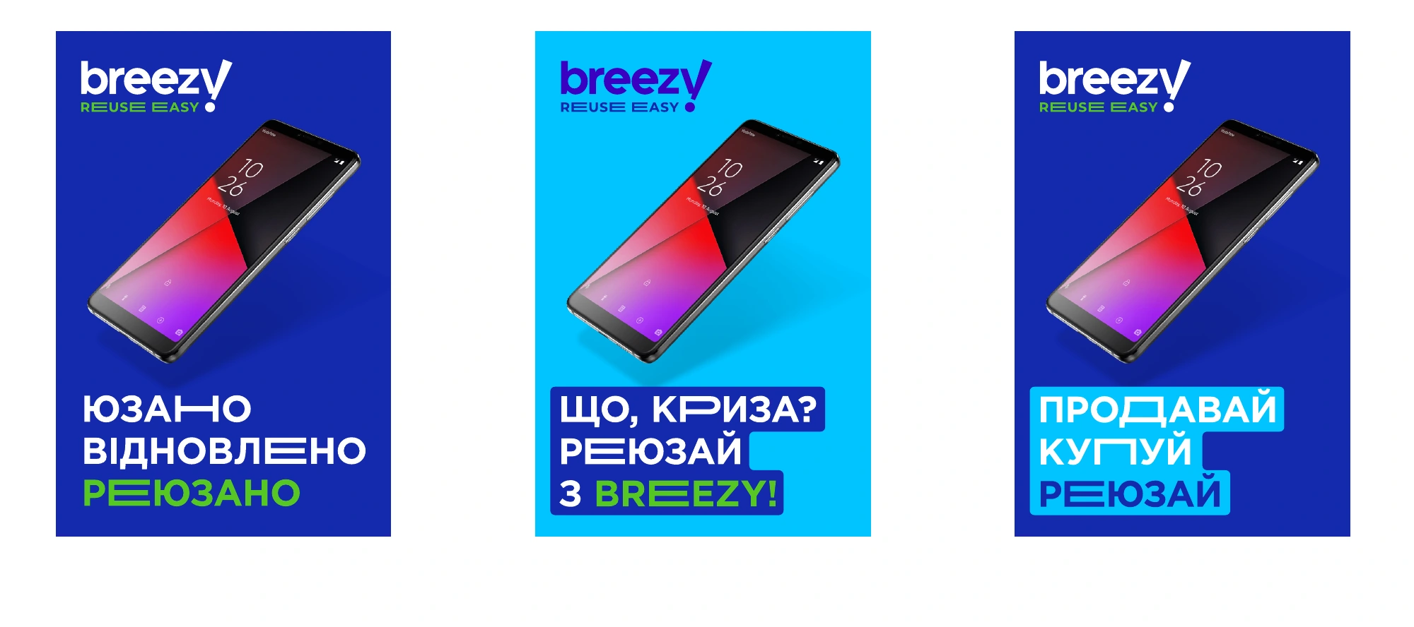
What the brand does for devices, the design does for words. The idea of extension becomes a recognisable graphic device.
A recognisable rhythm
and a voice of its own.
Stretched letters turn short phrases into graphics. In audio, the same principle becomes elongated sounds: ‘Breezy — re-e-euse ea-ea-easy’.
Conversational messages, wordplay around reuse and bright colours give the brand an easy-going character. The device can be repeated across different products and messages.
The full name.
A compact mark.
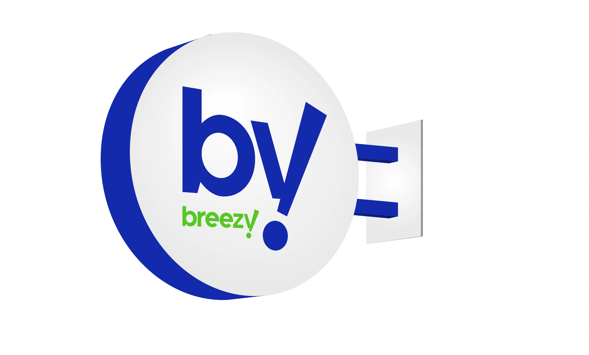
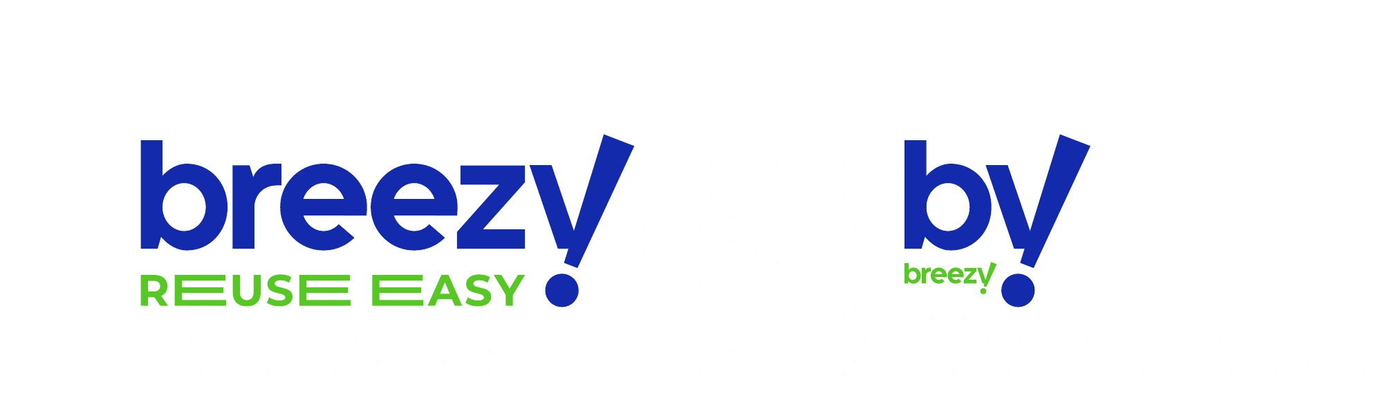
The main logo combines Breezy with Reuse Easy. A shortened version retains the lettering’s character in smaller spaces: app icons, compact applications and projecting signs.
Deep blue anchors the system. Green and light blue add contrast and shift the mood while staying within a shared palette.
#1329ADGreen
#55C724Light blue
#00C4FF
A fresh start
begins with a box.
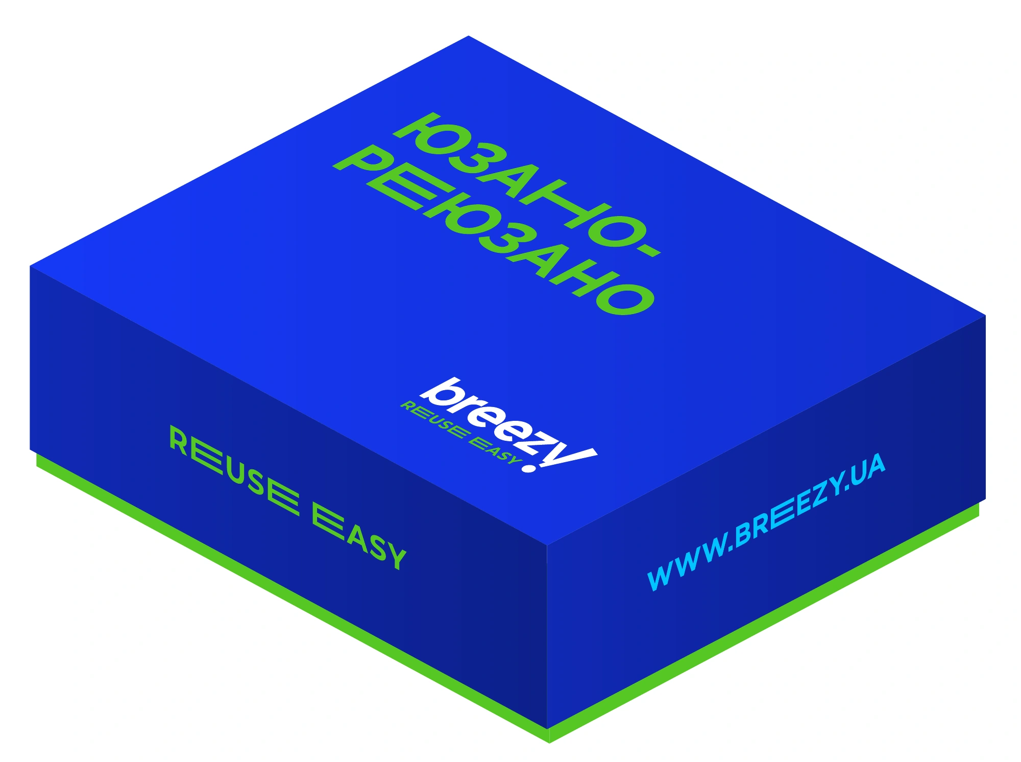
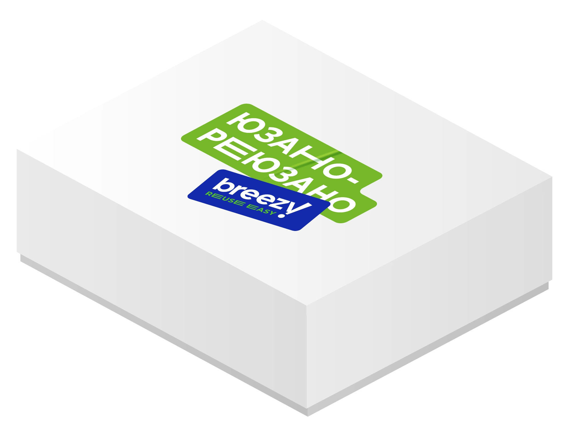
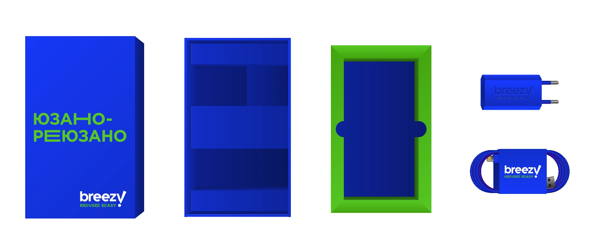
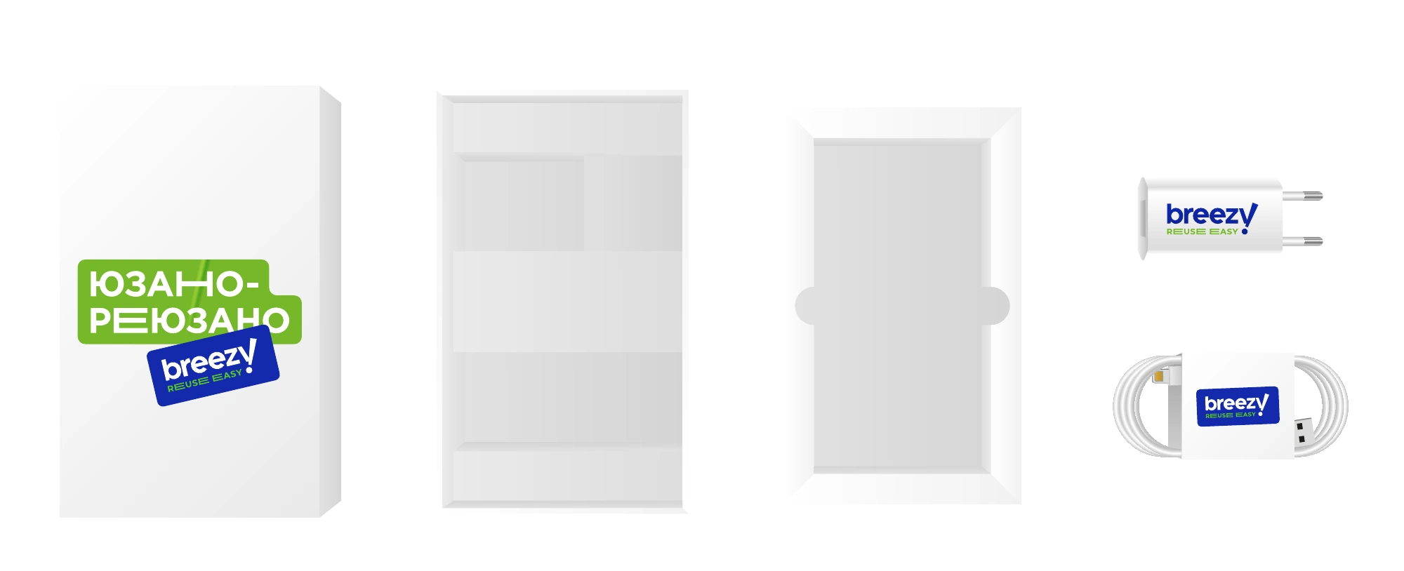
Packaging extends the brand’s core idea and makes receiving a device part of getting to know Breezy. We developed separate formats for smartphones and laptops.
The system provides two approaches: a printed branded box and a standard box with stickers. Shared colours, logos and messages connect both solutions.
One device.
Many applications.
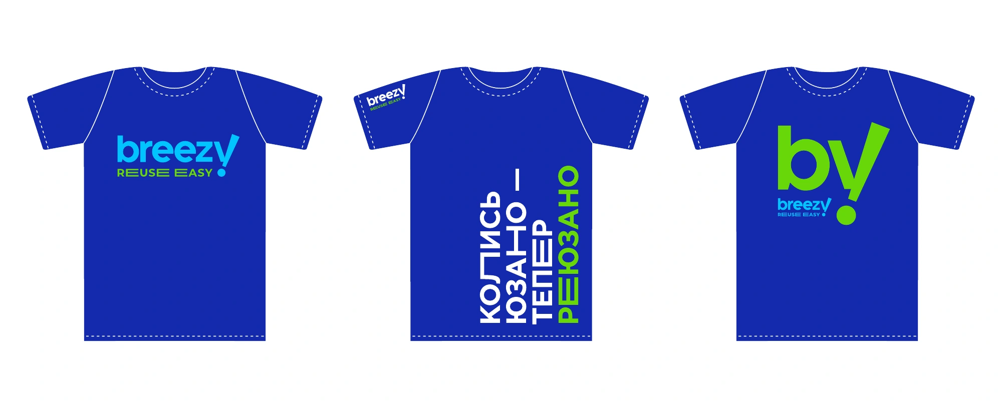
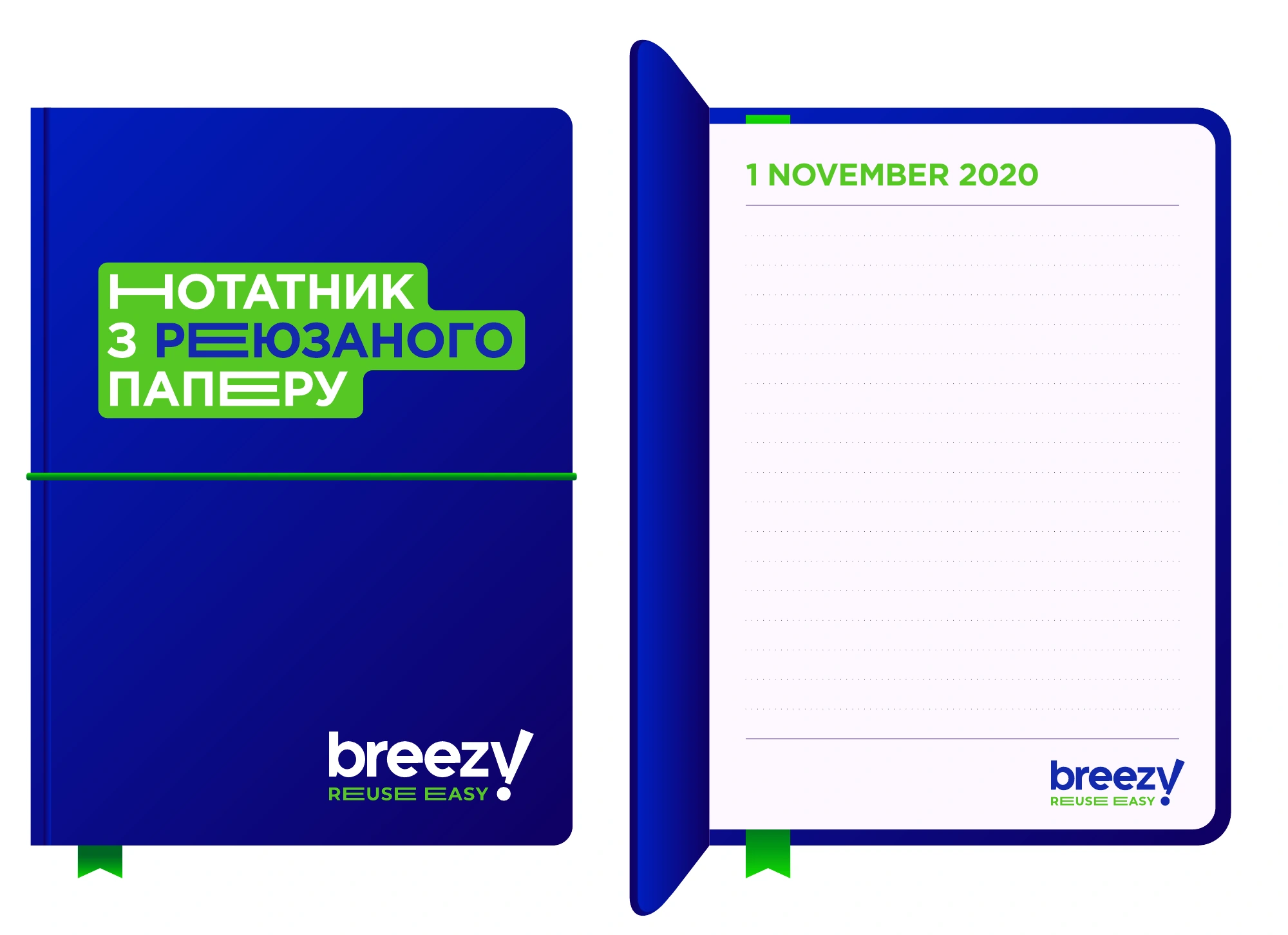
The wordplay continues on clothing and everyday objects. For example, the notebook message connects its material to the idea of reuse.
We documented the logo, colour, typography and composition principles in a guide. It provides a shared foundation for future materials and the different teams working with the brand.
From physical objects
to digital encounters.
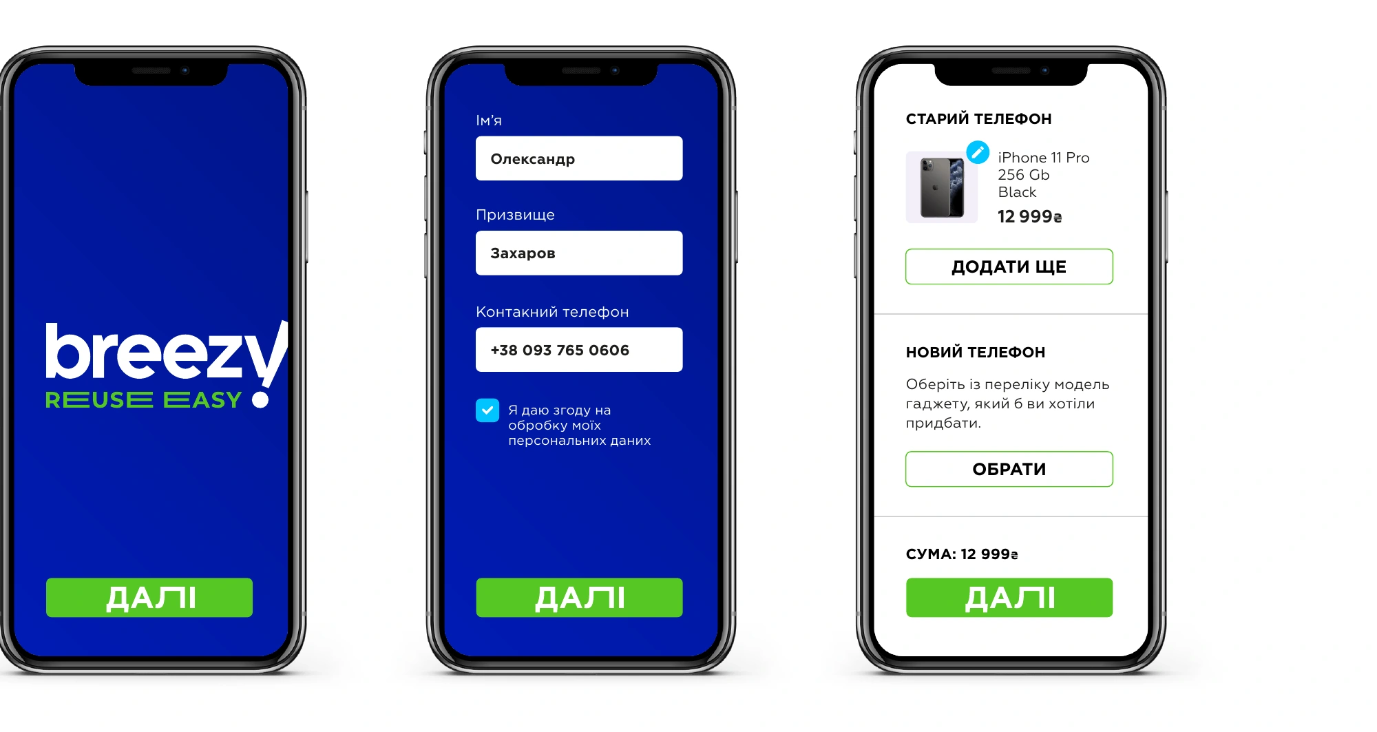
The shortened mark carries the identity into spaces and onto screens. We prepared signage and app interface concepts for these touchpoints.
One thought remains at the centre: give things a longer life, and people an easier next choice.