ICM.
The chemistry of possibilities.
Strategy and identity for a manufacturer of innovative chemical materials. A unified system for the company, its divisions and product communications.
Strategy · Brand architecture · Identity · Packaging
Explain the complex.
Build trust.
ICM works with materials for the food, pharmaceutical, cosmetics and other industries. Its products often remain invisible to end consumers, yet are part of how everyday things are made.
The brand’s task was to communicate the company’s expertise clearly to partners and connect its different divisions. The strategy, visual system and communication principles were compiled in a brand book.
Brand idea
I know
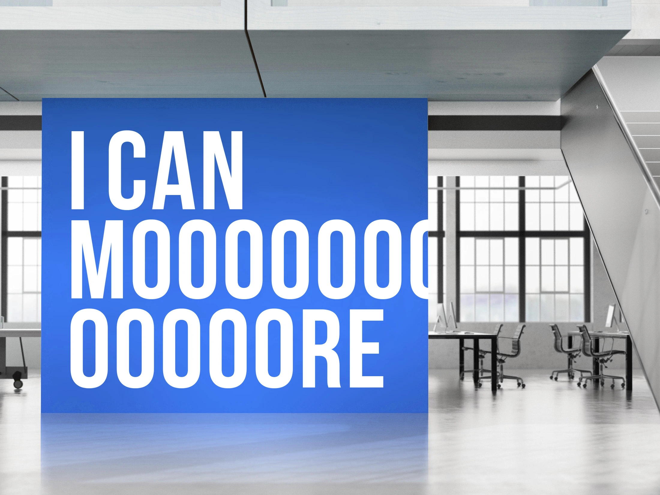
I can do more.
‘I know I can do more’ connects the ICM name with the ambition to discover new possibilities in materials and technologies.

Different industries.
Shared expertise.
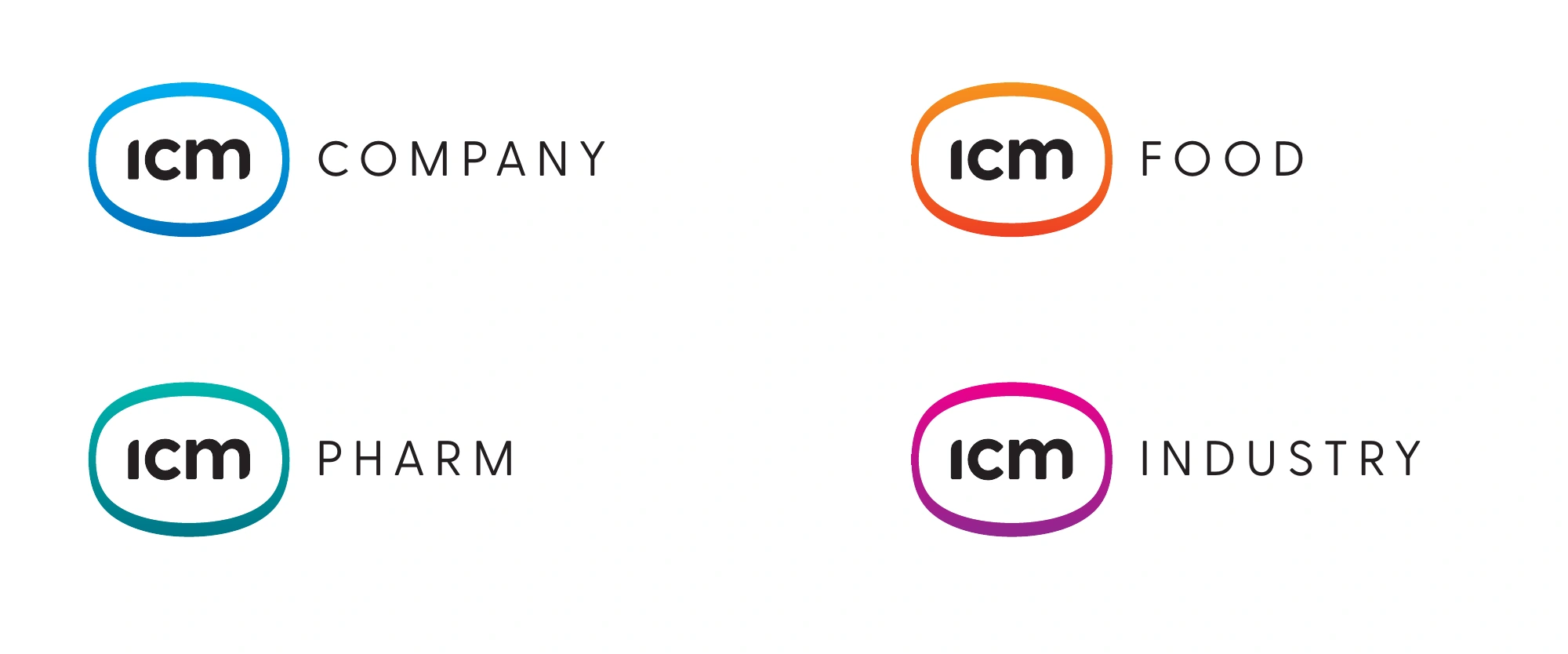
Innovative Chemical Materials explains what the company does. Company, Pharm, Food and Industry structure its divisions while retaining the shared ICM mark.
Colour gradients distinguish the divisions. The logo structure stays consistent, so a new division does not need a separate visual world.
A product with its own
place in the system.
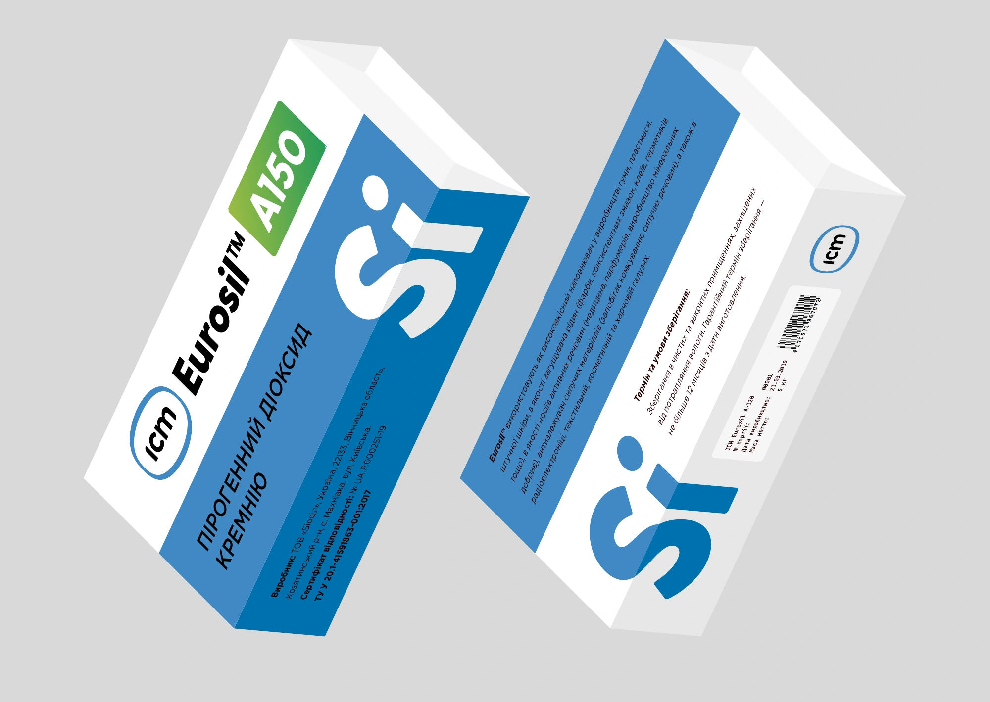
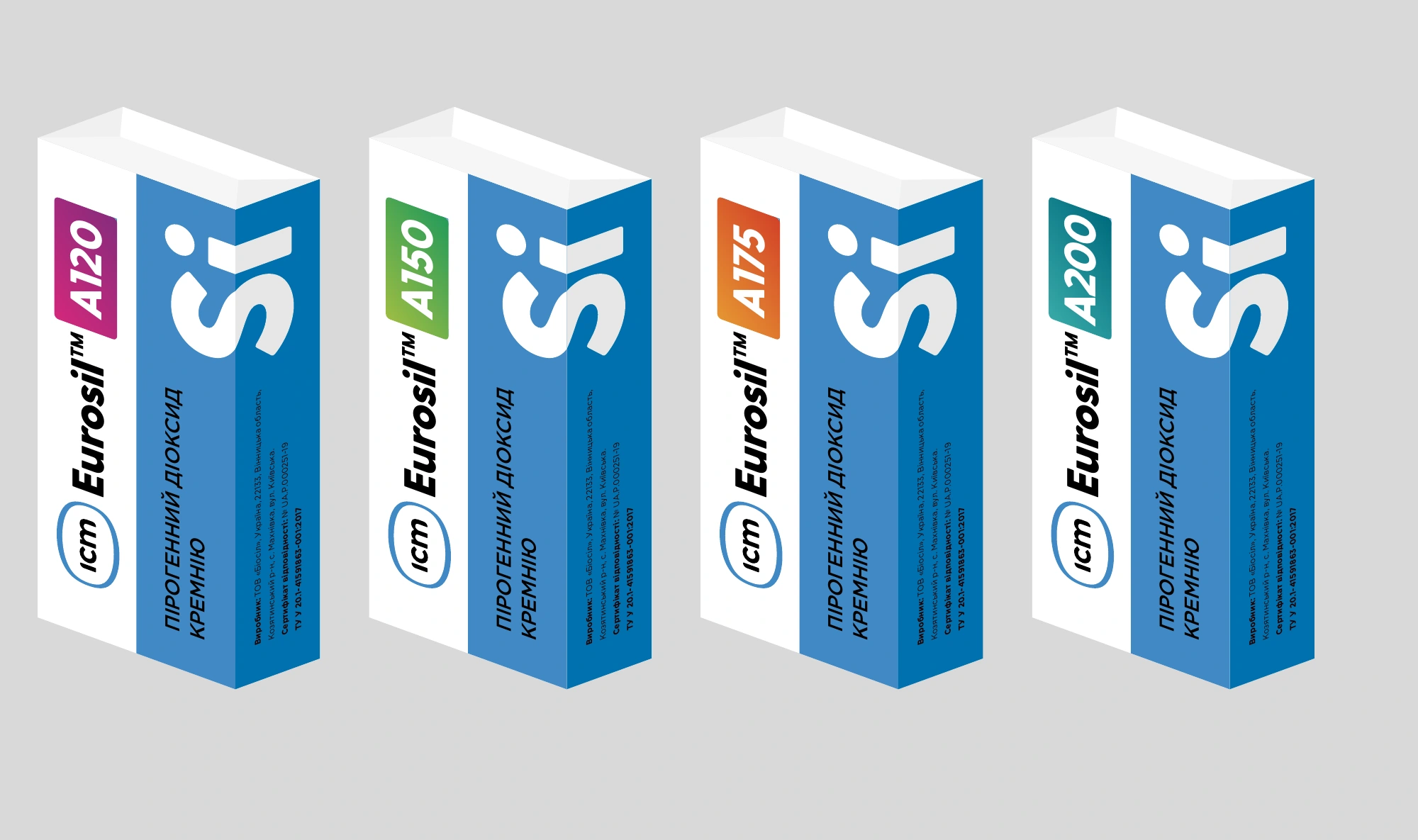
For Eurosil, we designed the product range around a clear hierarchy: a large Si symbol, the material name and the specific grade designation.
Technical information becomes part of the packaging design. A shared composition unites the range, while accent labels help distinguish products.
From specifications
to a partner conversation.
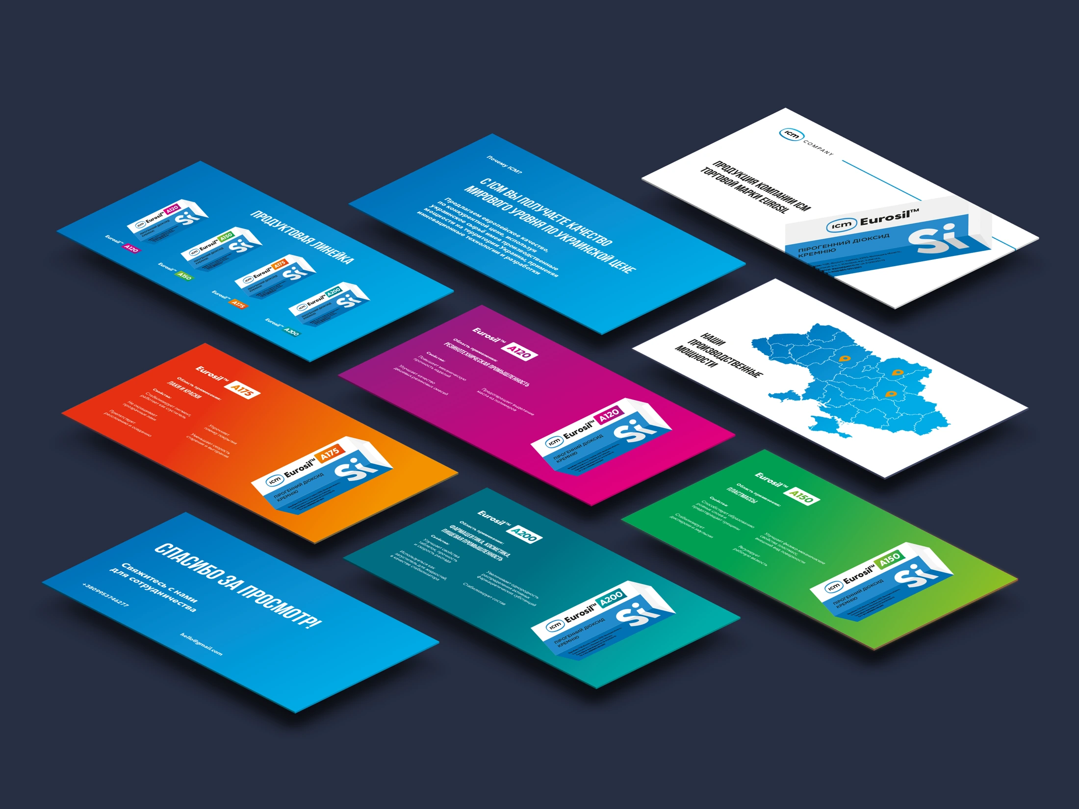
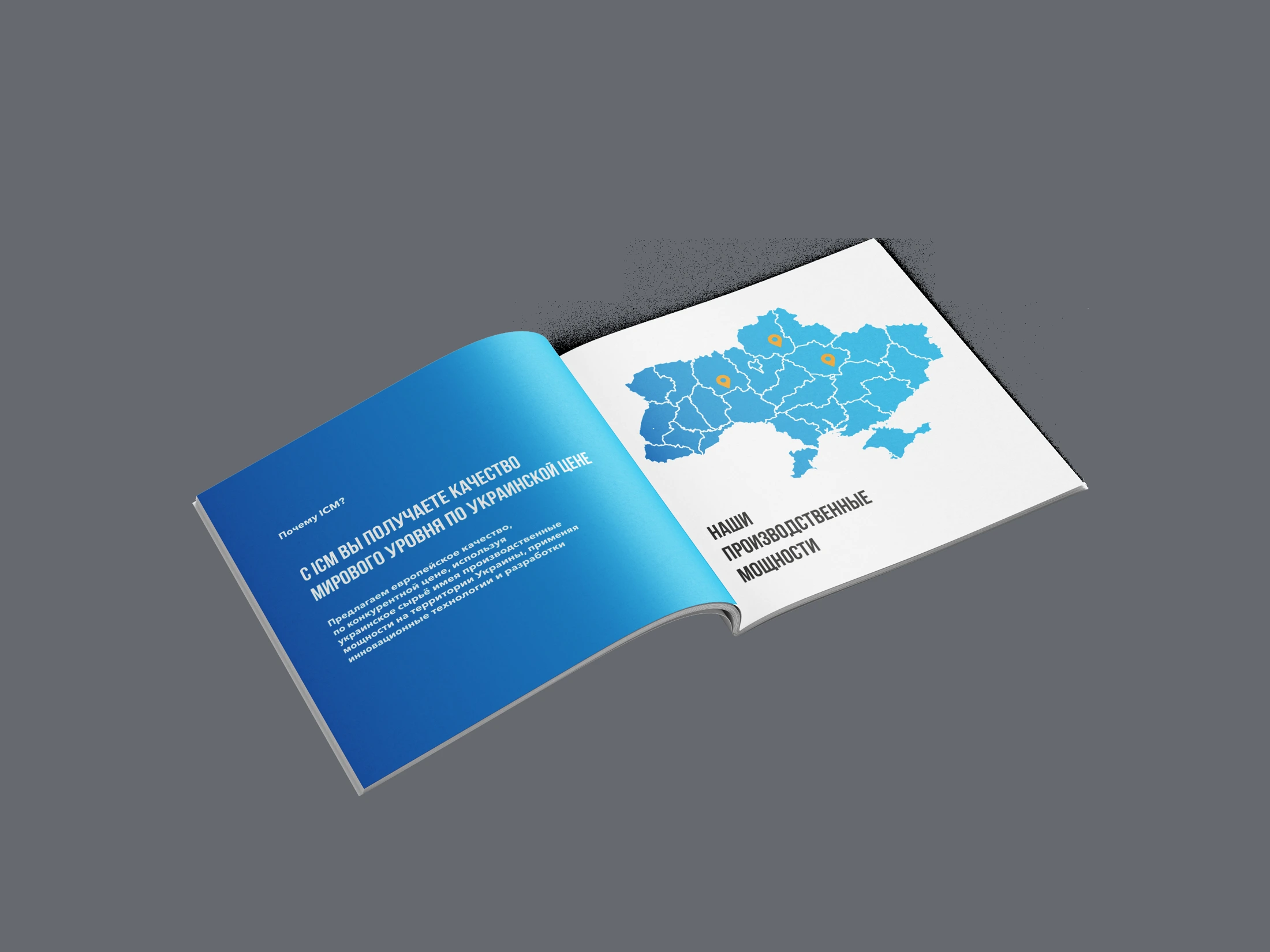
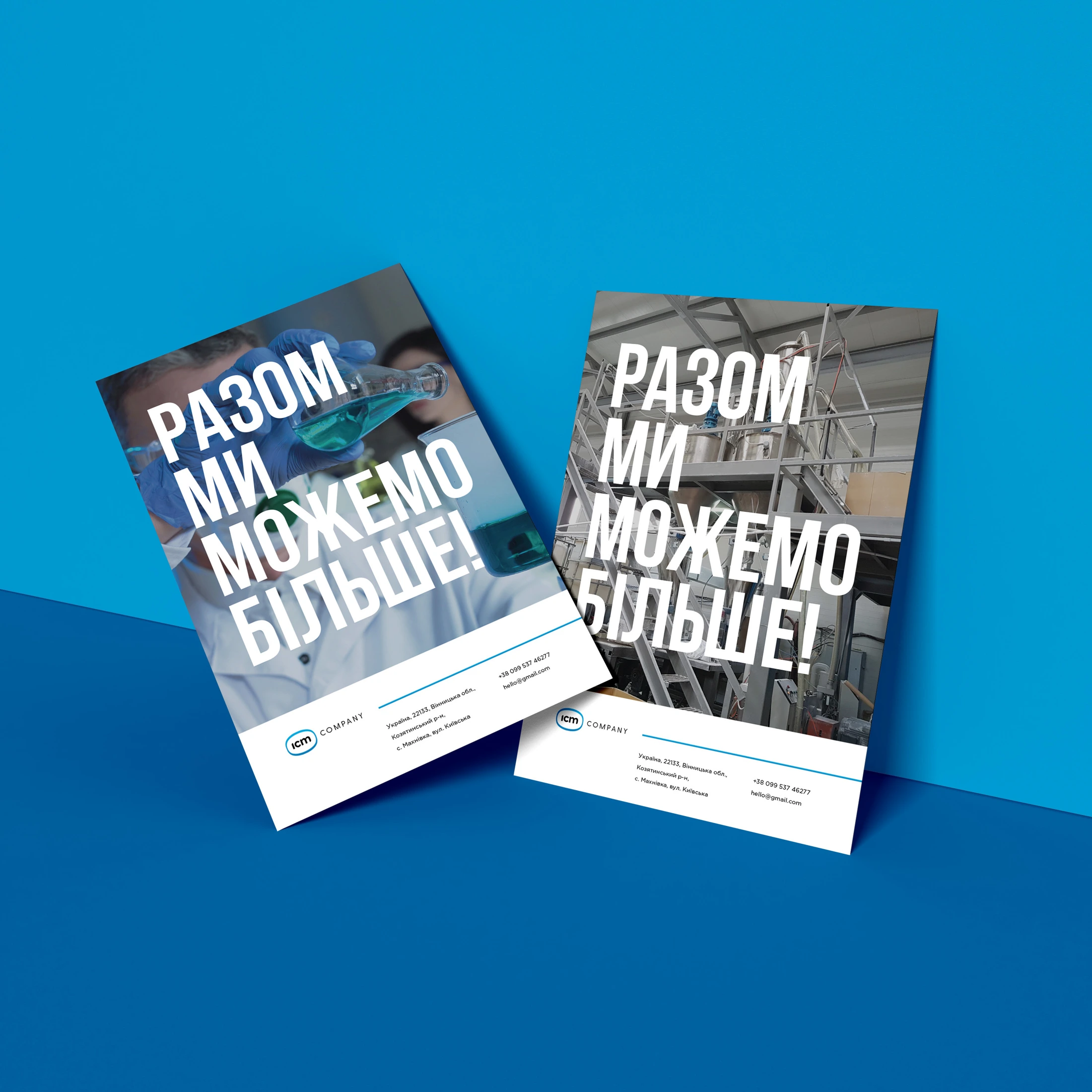
Catalogues, brochures and presentation materials extend the packaging system. Products, their uses and their place in the range follow one visual logic.
Contrasting typography and colour blocks organise the content. The brand remains recognisable in both a short message and a detailed presentation.

One language
for different encounters.
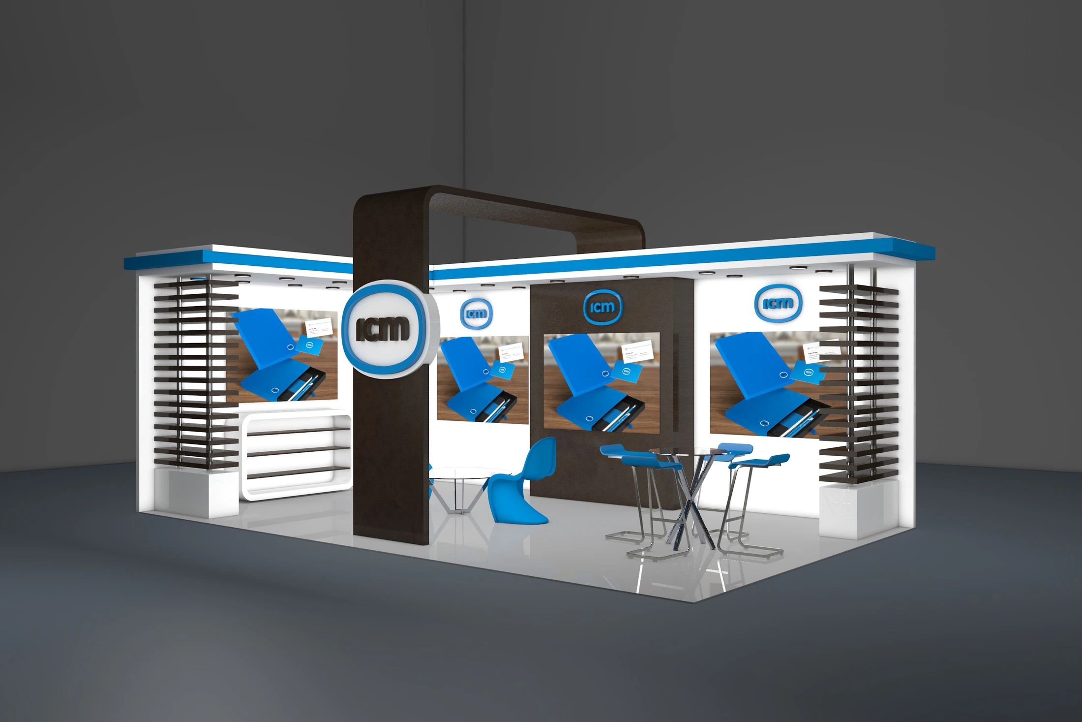
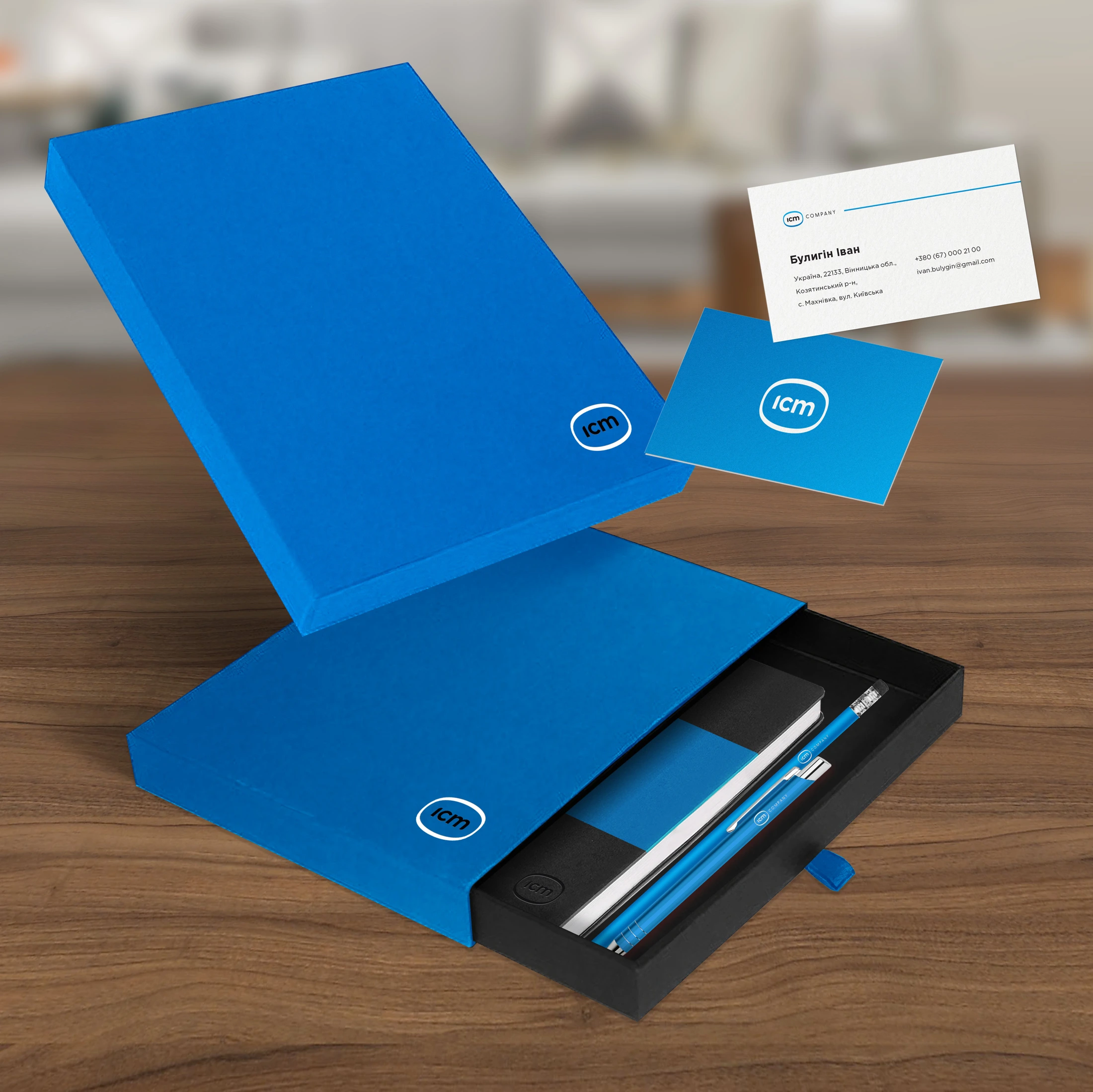
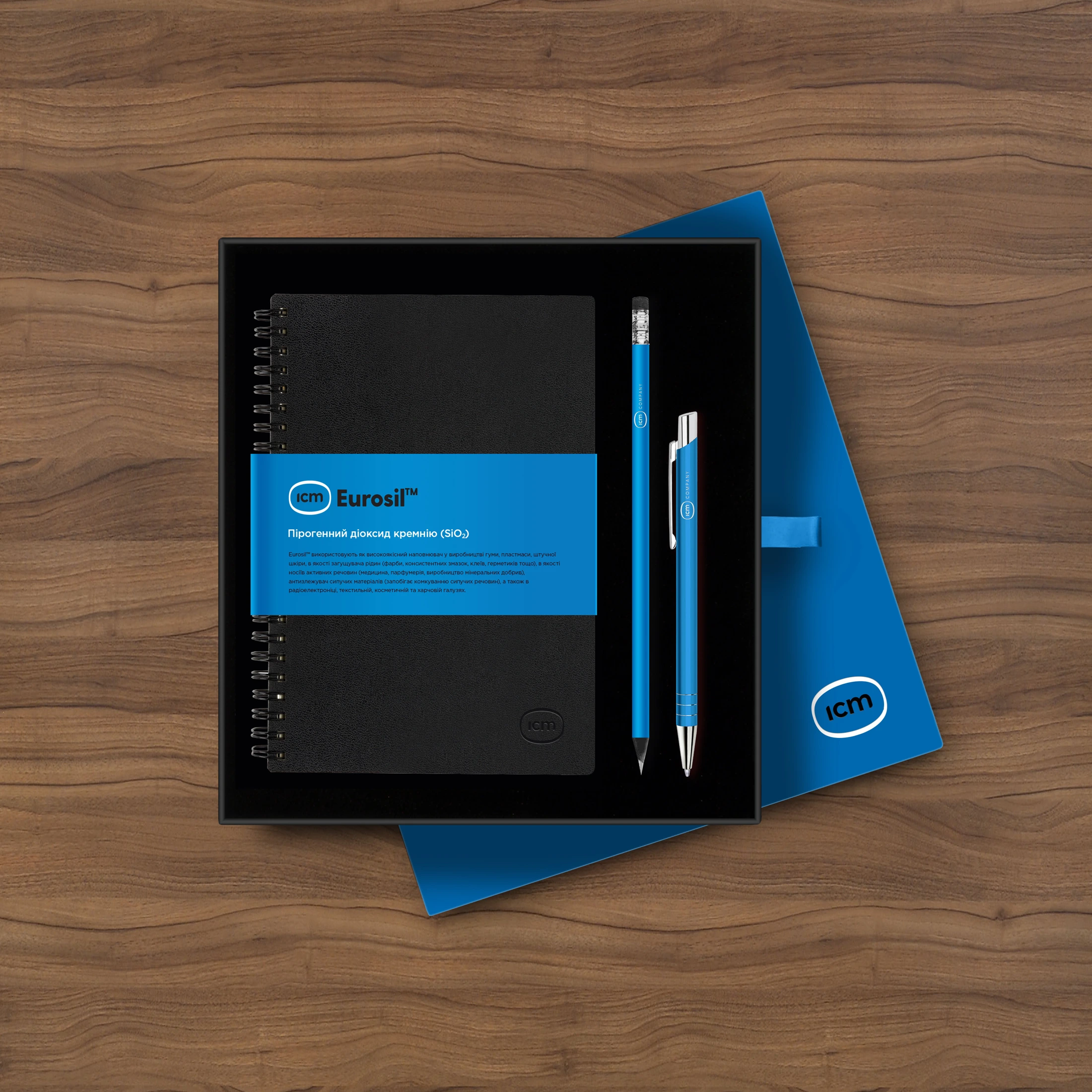
The visual system extends to exhibition concepts, business stationery and office design. A large mark works across broad surfaces, with a compact version for personal items.
The images below are design visualisations, showing how the identity moves from print into spaces and objects.