ReStart.
Your space
for wellbeing.
Naming and visual identity for a fitness club where movement goes hand in hand with physical and emotional wellbeing.
Naming · Identity · Communications
A fresh start.
At your own pace.
ReStart is a fitness club in Chernihiv with a personalised approach to training. Its work centres on each person’s fitness level, needs and wellbeing.
We explored the club’s approach, spoke with its manager and trainers, and analysed competitors. This informed a name and visual identity drawing on yoga, harmony and healthy living.
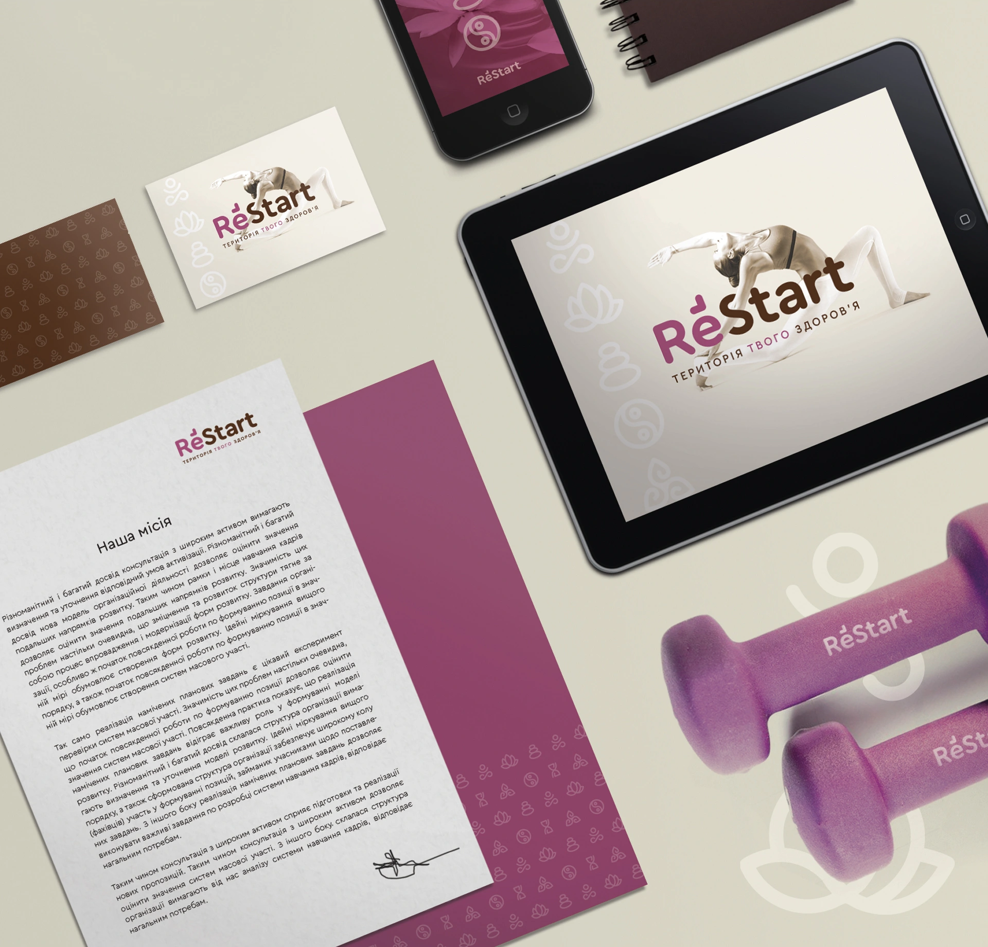
A name that
invites you to begin.
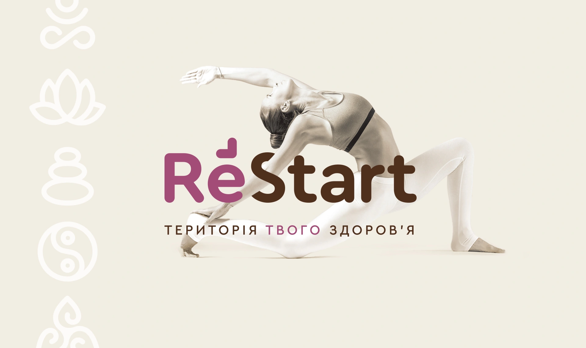
ReStart expresses the idea of a fresh start: a chance to reconnect with yourself and take the next step. The message ‘Your space for wellbeing’ supports it.
The symbol combines an infinity sign with an arrow. In the simplified version, the arrow remains above the letter ‘e’, retaining the sense of movement.
Brand character
Movement. Balance.
Care for yourself.
Soft beige, muted purple and warm brown create a calm alternative to a hard-edged sports aesthetic.
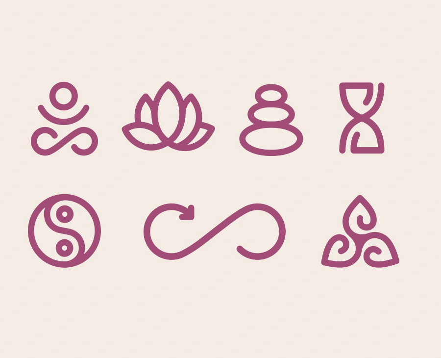
Symbols that
work together.
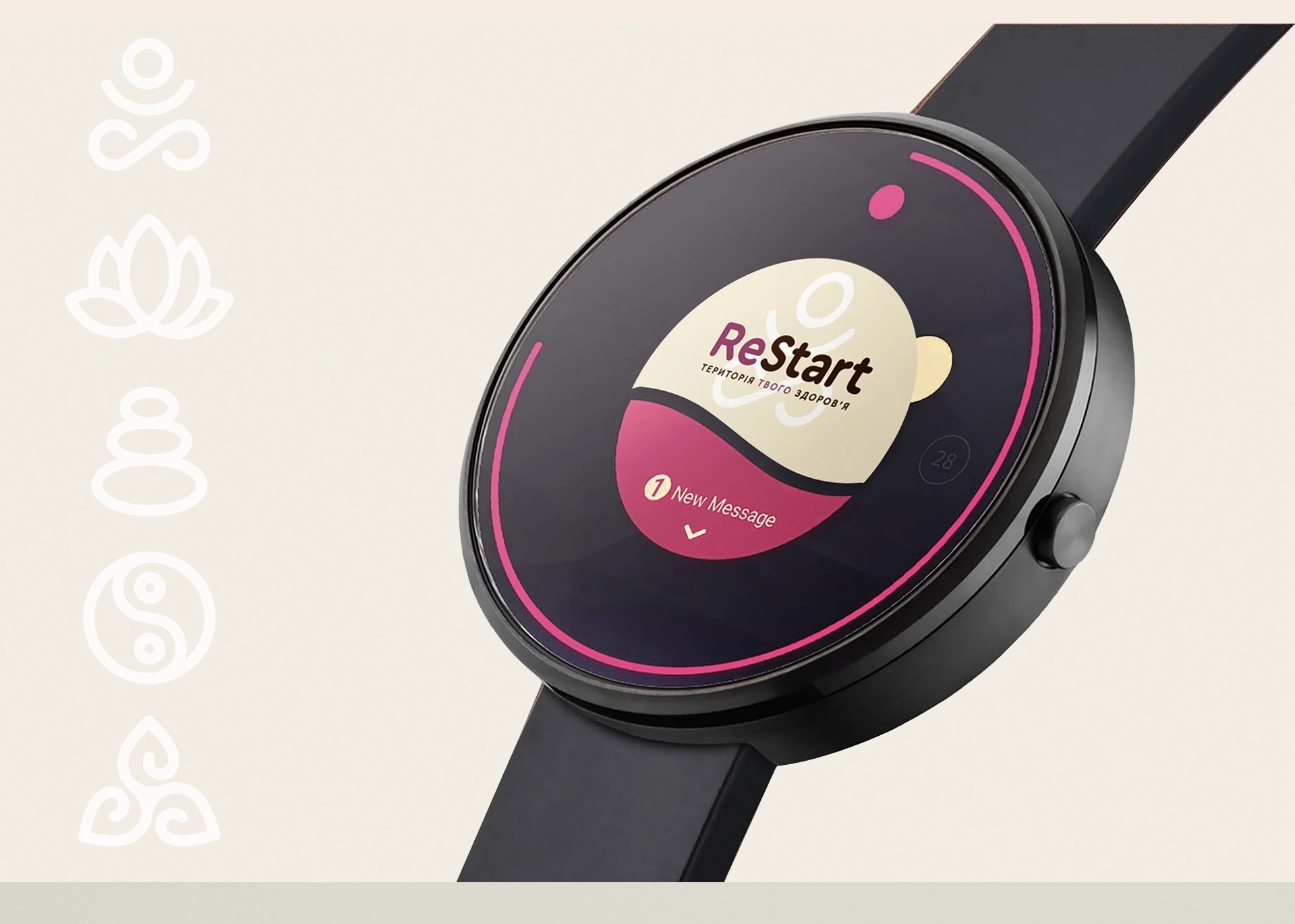
A lotus, balancing stones, a human figure and an infinity sign form a family of graphic elements, supporting the themes of inner balance and movement.
The elements can stand alone, form a pattern or combine with photography. The system extends the logo’s character across different applications.
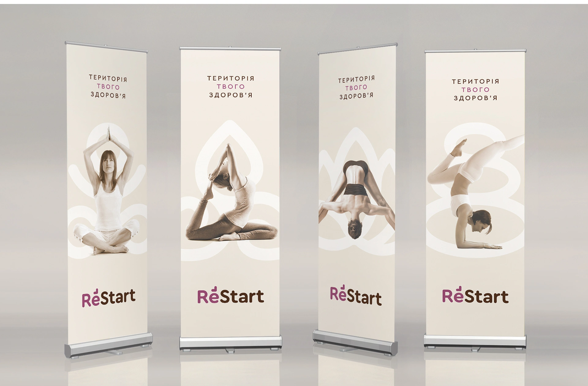
One voice
across different formats.
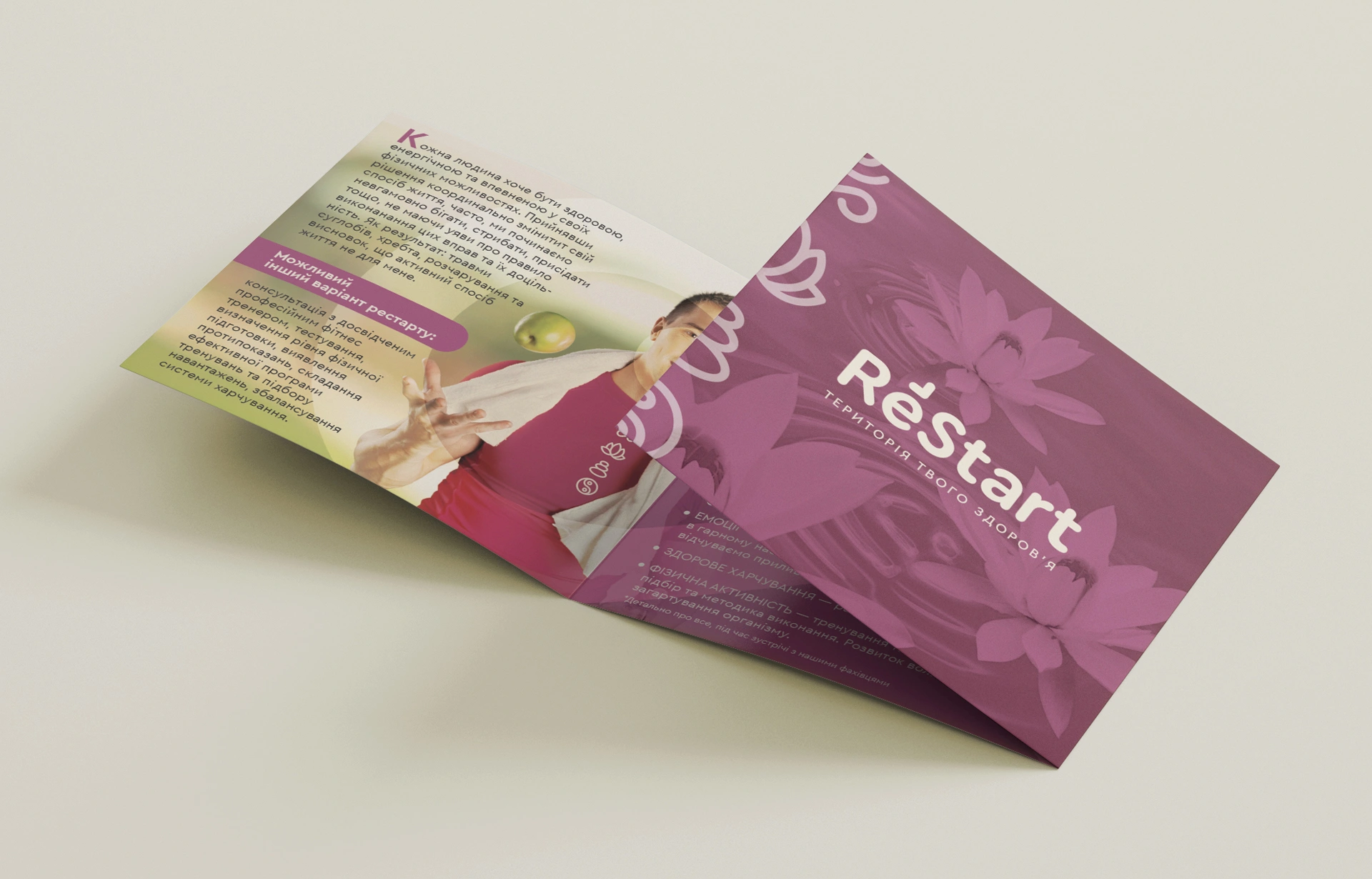
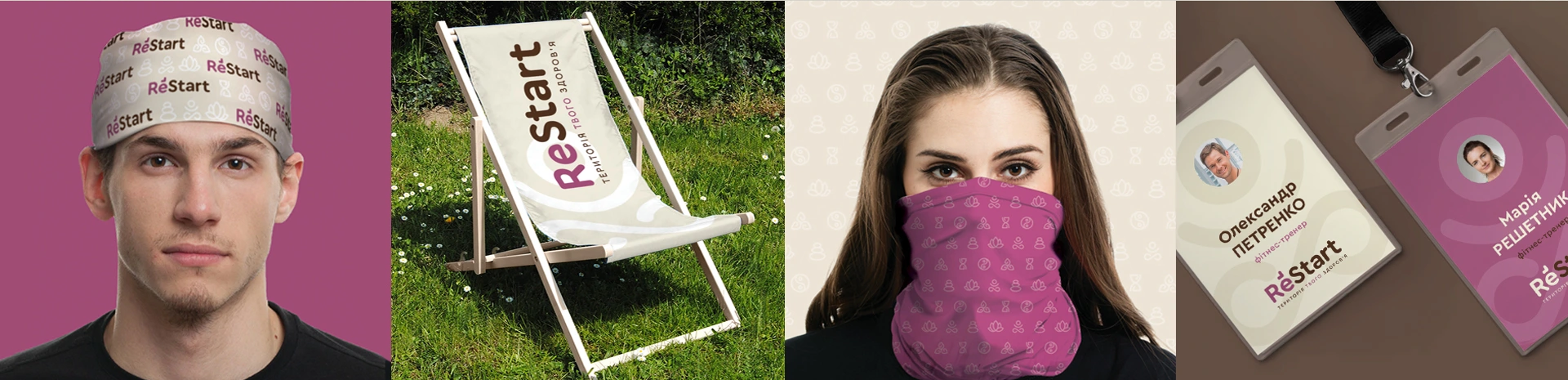
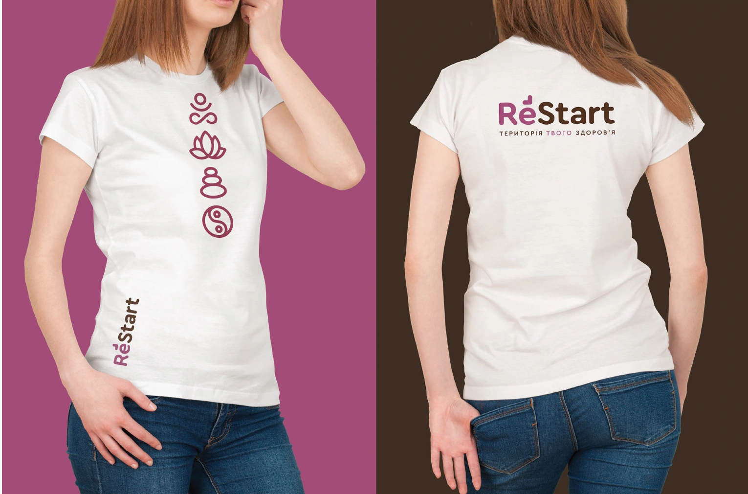
We extended the identity to posters, clothing, print and promotional materials. Large symbols and a calm palette connect them without overwhelming the composition.
The guide brings together the logo, graphic elements, typography, colours and application principles.