Aster Park.
Different reasons.
One place.
Naming and identity for a retail destination in Nizhyn — from a shared name to facade design and everyday applications.
Naming · Identity · Spatial design
Unite the space.
Keep the variety.
Different shops, products and venues coexist within a retail destination. Visitors need to see a place with its own name and character behind the individual signs.
For Aster Park, we developed a name and identity system that could extend into the space, communications and its own retail formats.
One foundation.
Several formats.
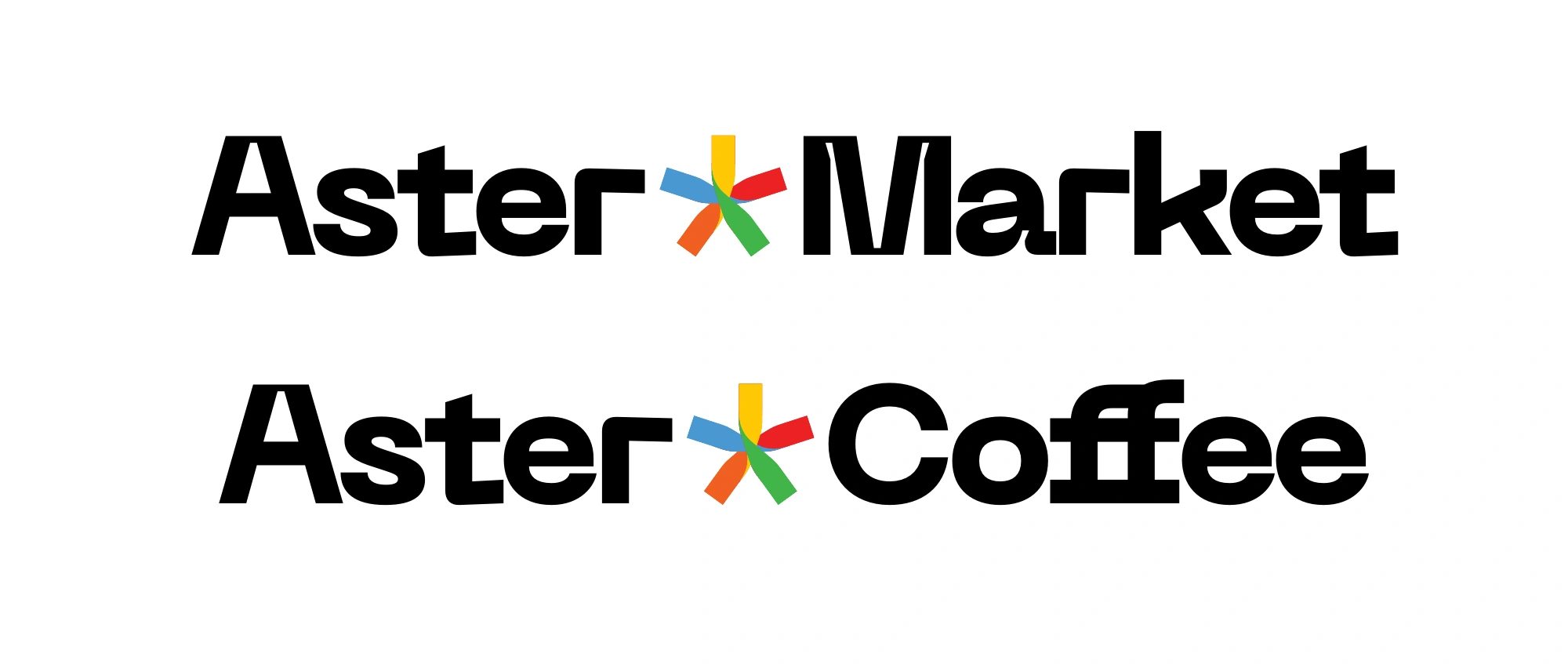
Aster Park, Aster Market and Aster Coffee share a naming and logo structure. The format changes, but the connection to the wider brand remains.
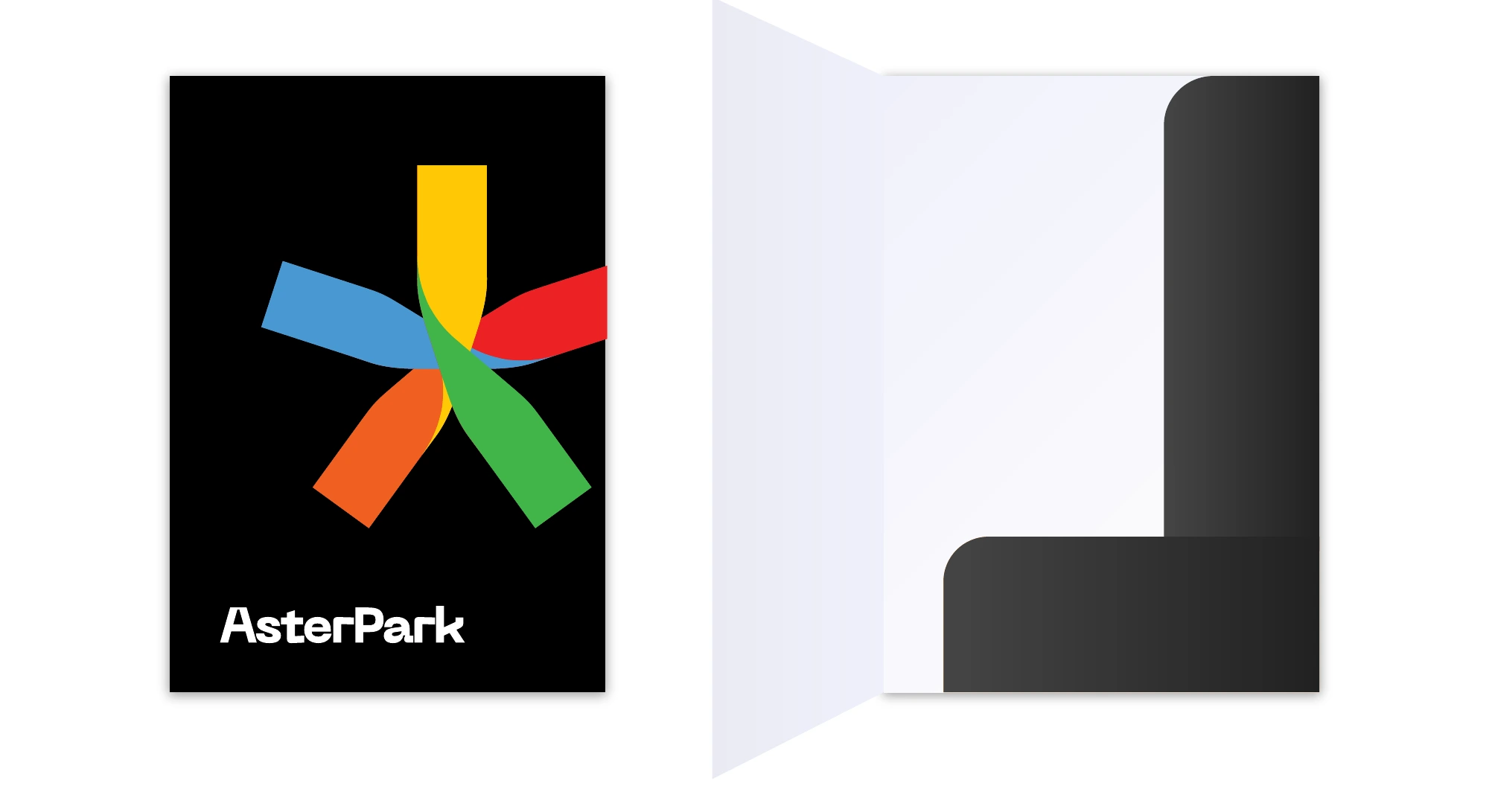
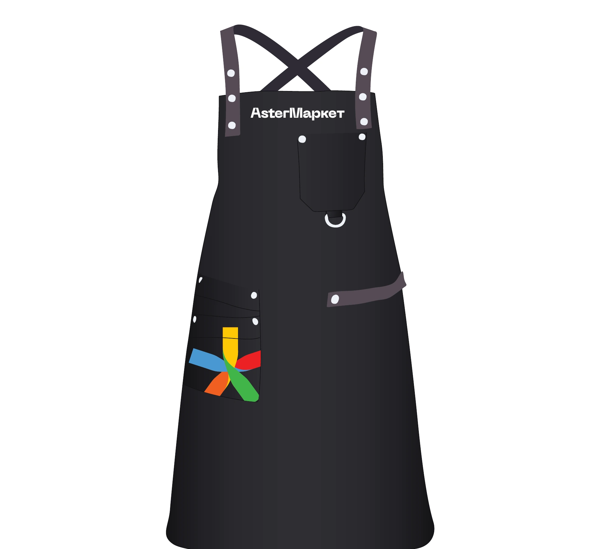
The coloured symbol becomes a shared accent. It works within the logo and on its own, as a recognisable element on clothing, packaging and business materials.
The system’s principle
A shared mark.
A lively character.
A restrained black-and-white foundation leaves room for colour, products and short messages.
Speak simply.
Stand out.
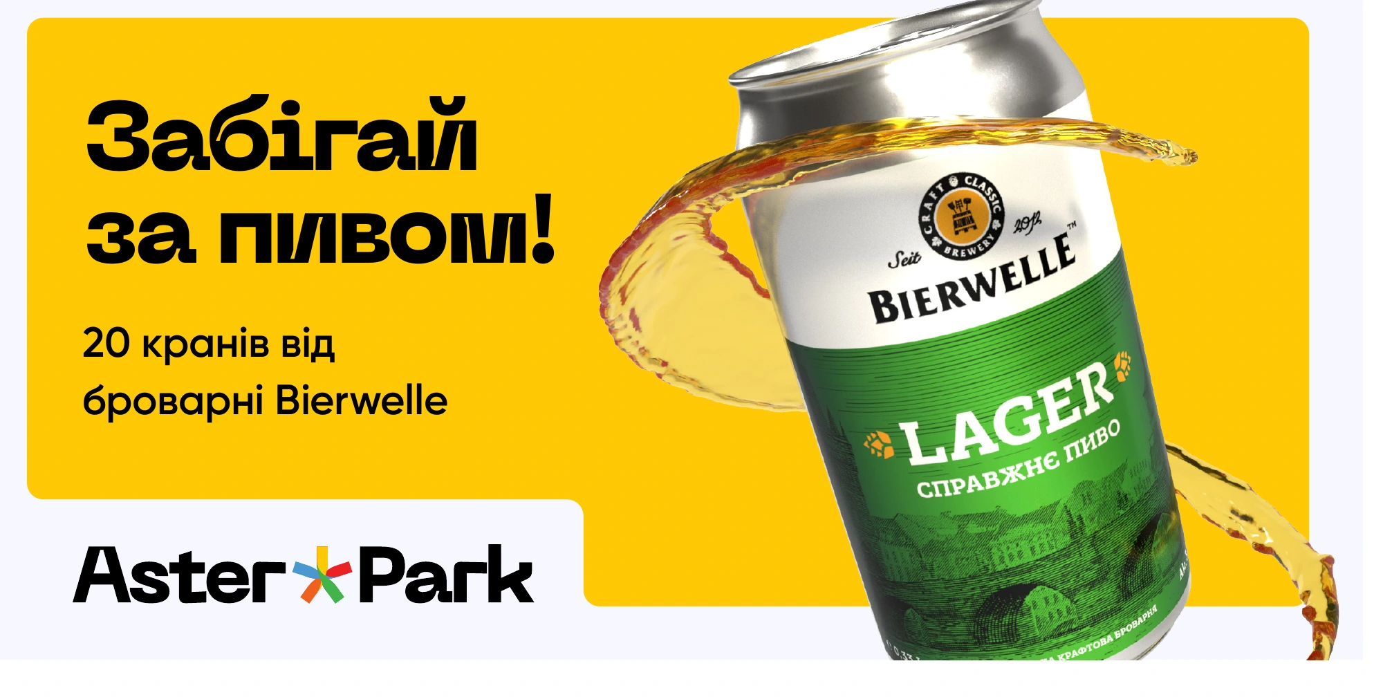
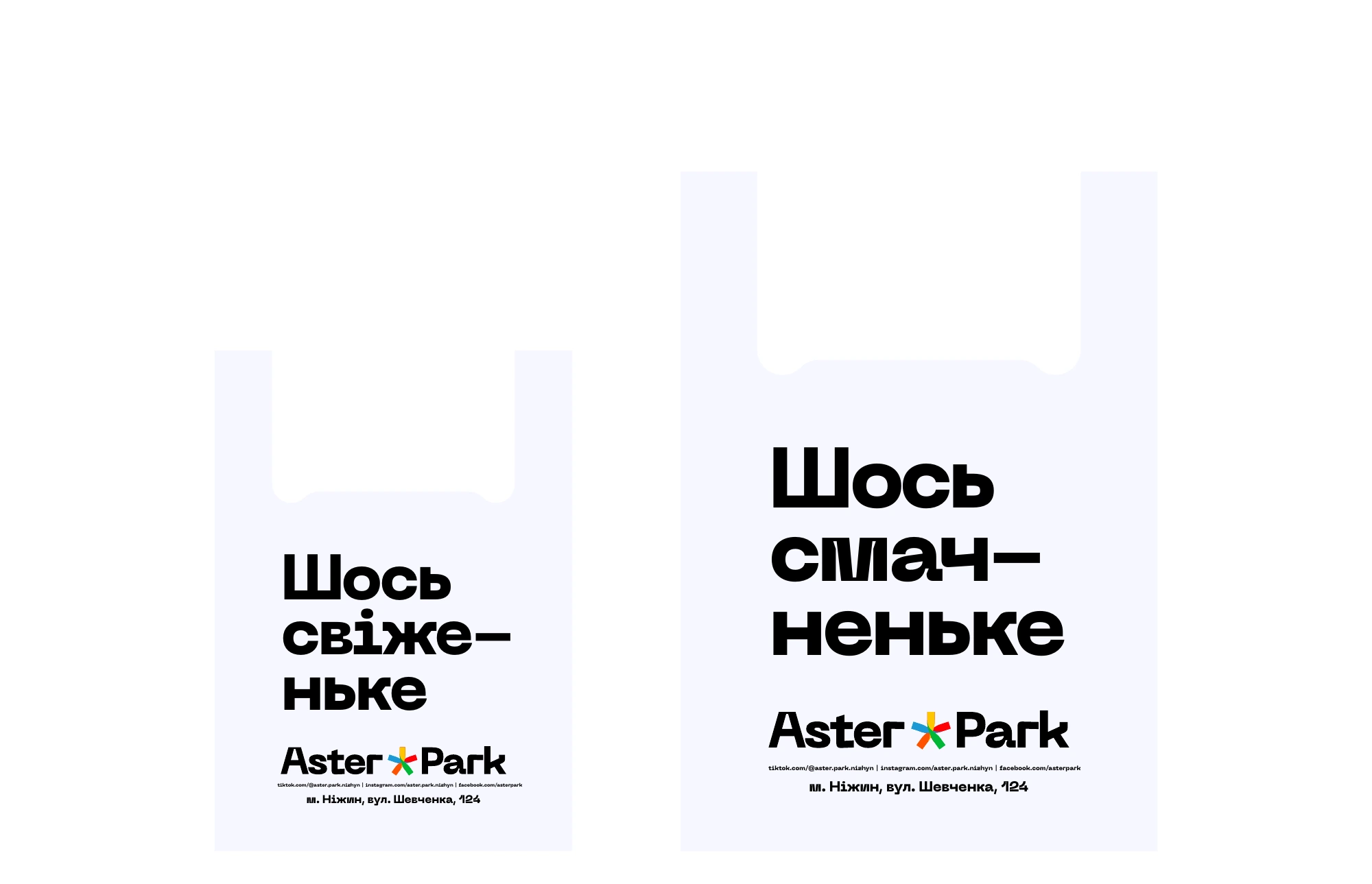
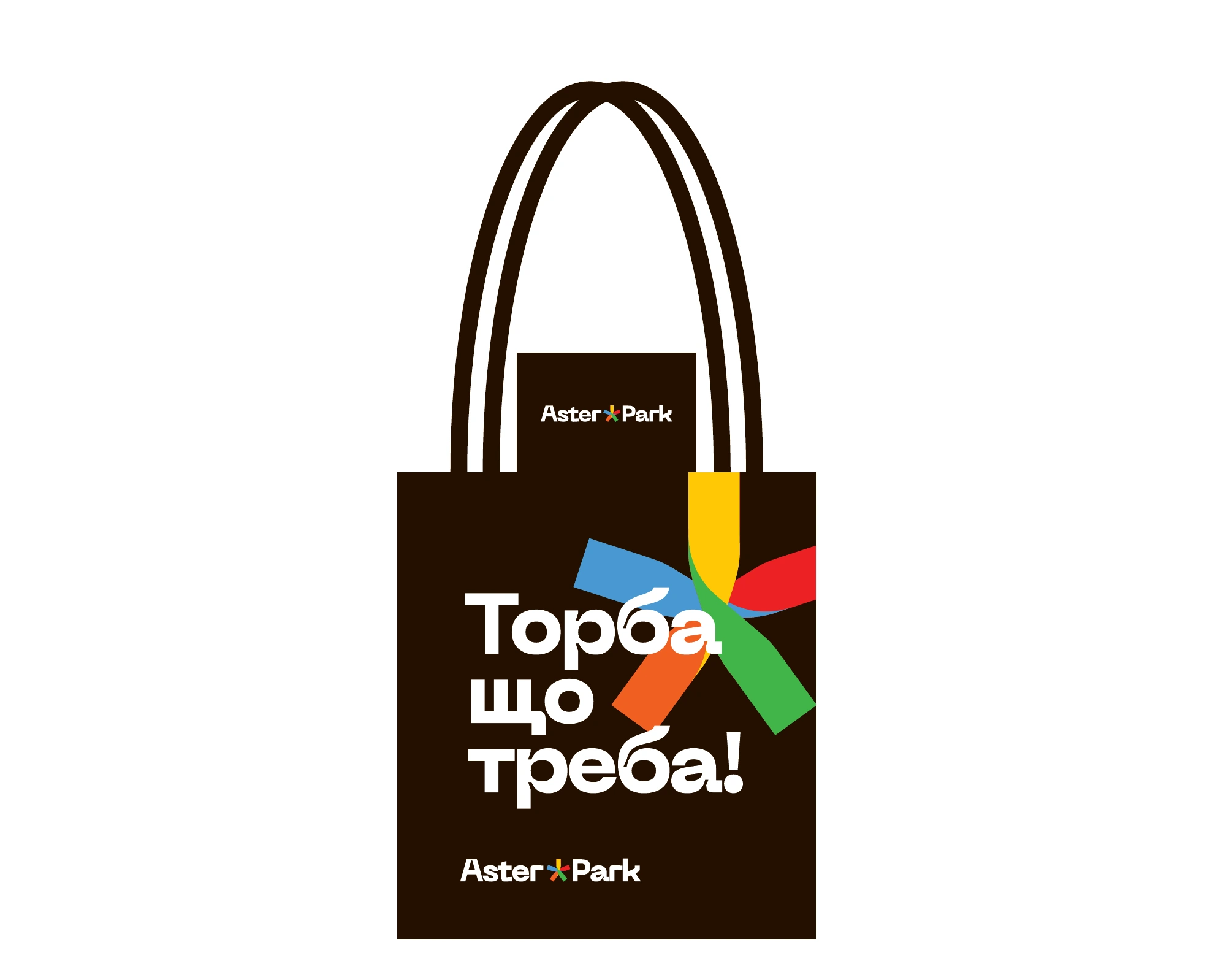
‘Drop in for a beer!’, ‘Something tasty’ and ‘Just the bag you need!’ bring the brand into everyday life. These short lines give people a concrete reason to visit or buy something.
Large lettering, contrast and a colour accent give the system presence at different scales, from an advertising message to a shopping bag.
The brand in everyday
touchpoints.
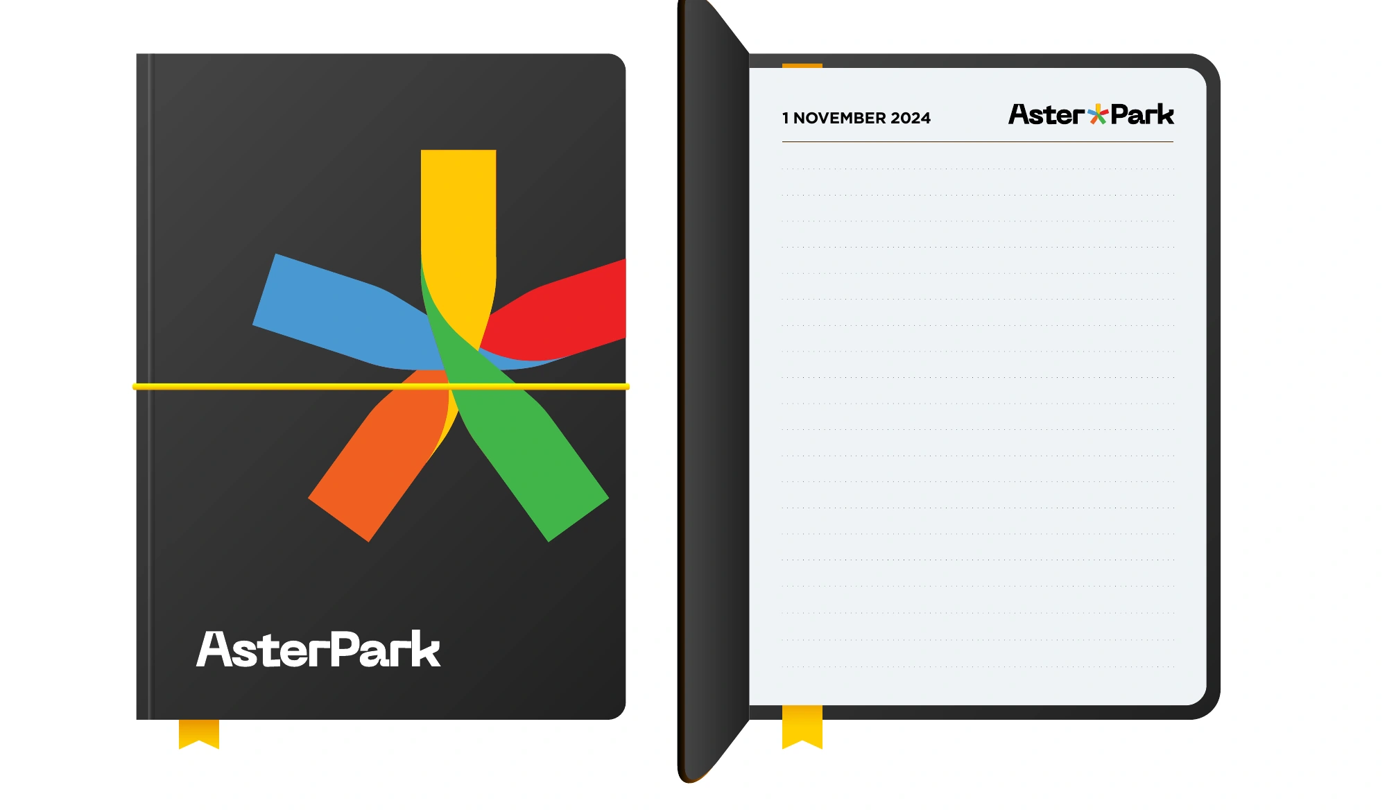
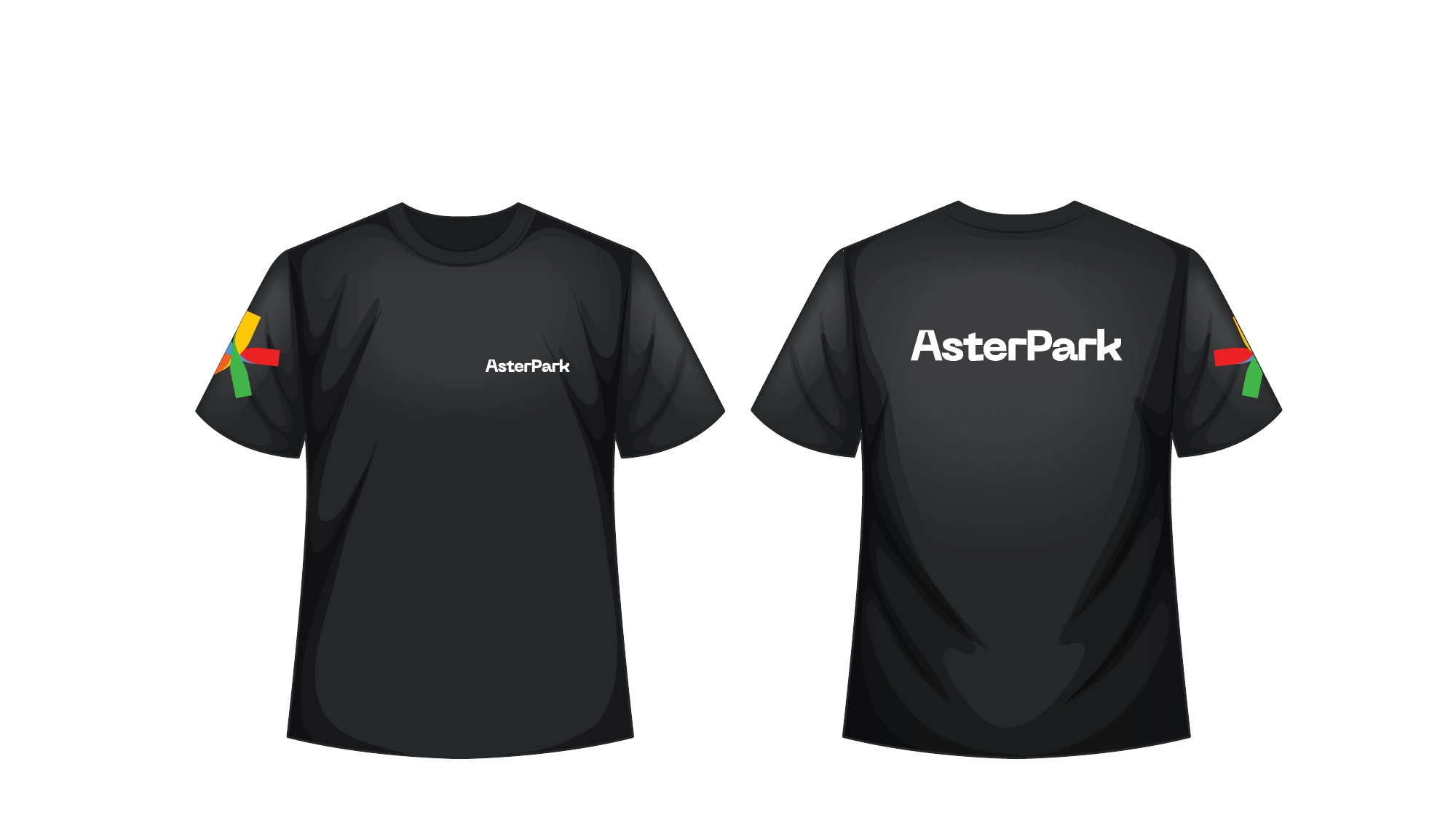
The identity extends to team clothing, accessories, business materials and packaging. Logo, colour, typography and wayfinding principles were collected in a guide.
It provides a shared basis for future applications: different in function, but still part of Aster Park.
From artwork
to the city.
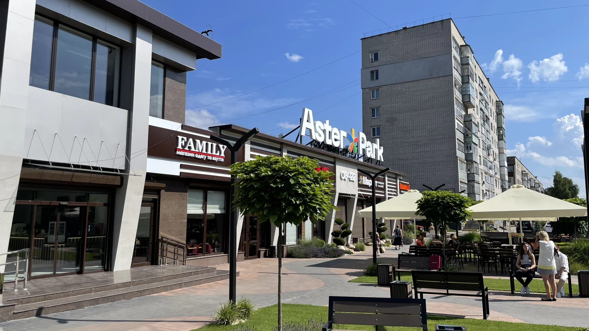
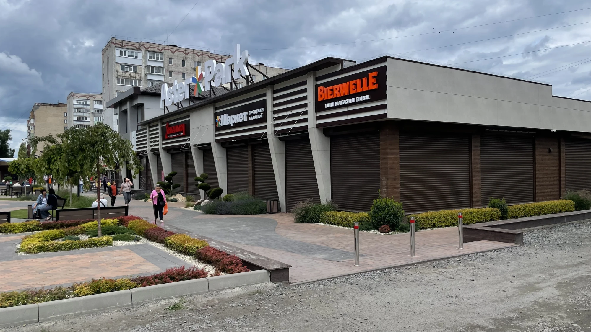
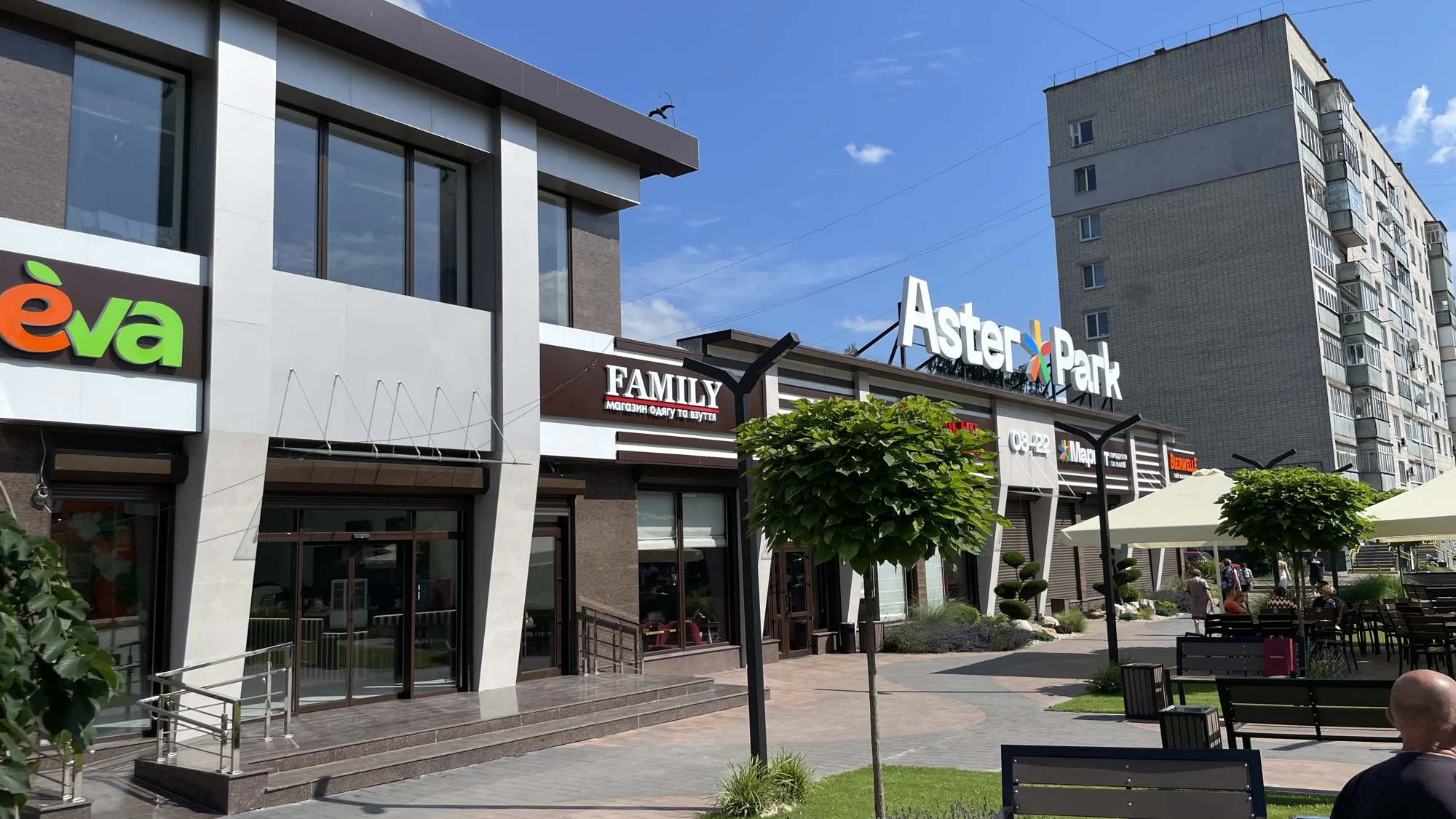
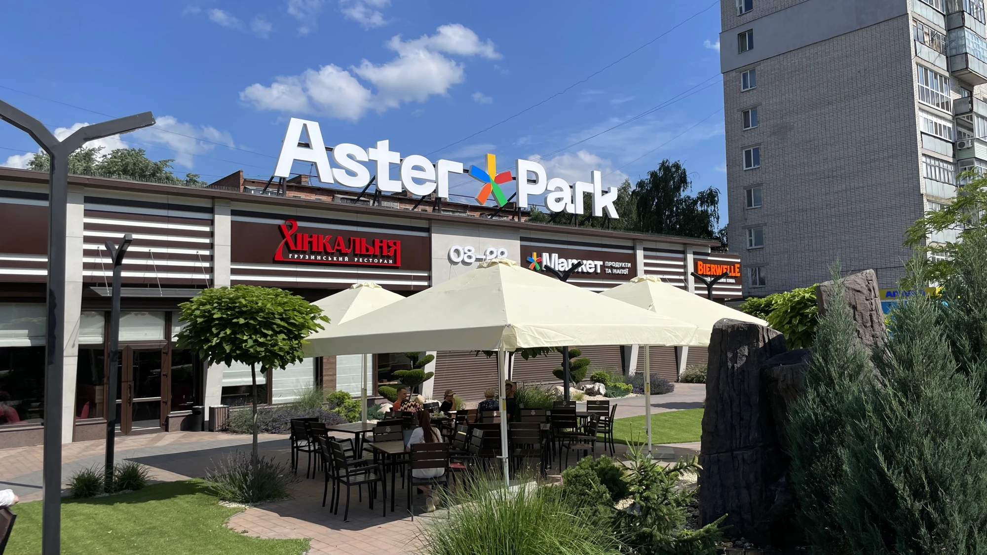
On the facade, the mark and name must work alongside tenants’ signs and remain legible from a distance. Implementation photographs show the brand in its real surroundings.