Bierwelle.
When you’re true to yourself.
Rebranding a craft brewery from Chernihiv.
2019 · Strategy · Identity · Packaging
About the project
Bierwelle is a craft brewery from Chernihiv, brewing since 2012 and developing its own network of shops and venues. As its range grew, the labels became inconsistent and the brand lacked a coherent, recognisable identity.
The challenge
Refresh perceptions of Bierwelle and strengthen recognition to support regional growth and entry into national retail.
Develop the strategy and positioning, create a unified visual identity and document its use in a brand book.
First,
understand people.
We explored the company, production, competitors and customers. We spoke with the owner, brewers and employees, and studied what drove purchasing decisions in shops and venues.
Authenticity became the heart of the strategy: in people’s work, passions and relationships. This led to the idea ‘When you’re true to yourself’.

Character
you can see.
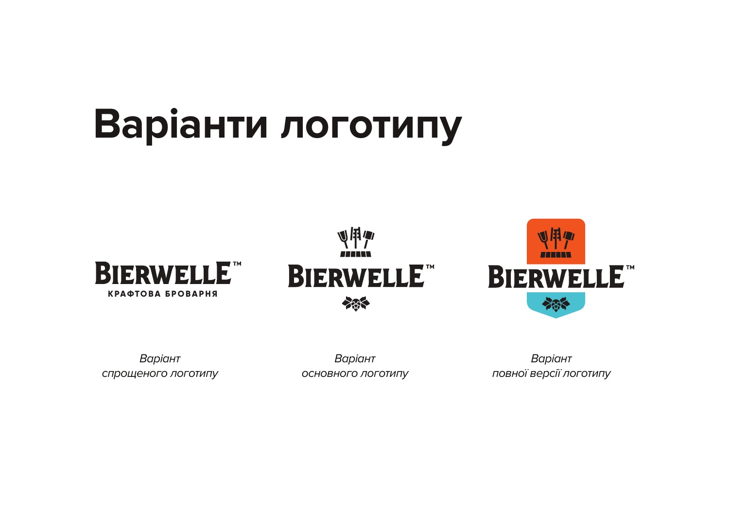
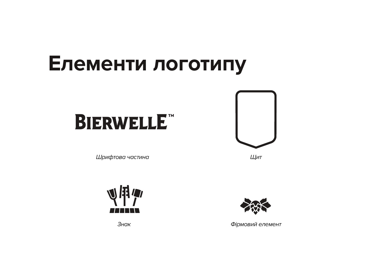
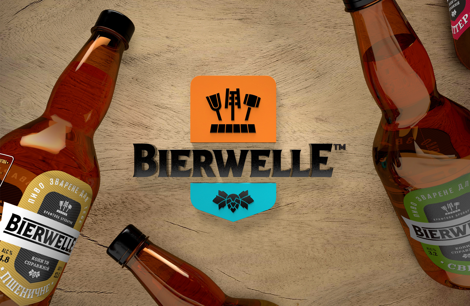
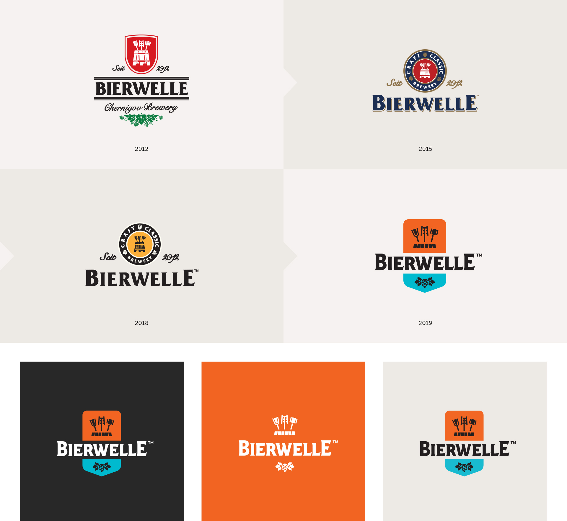
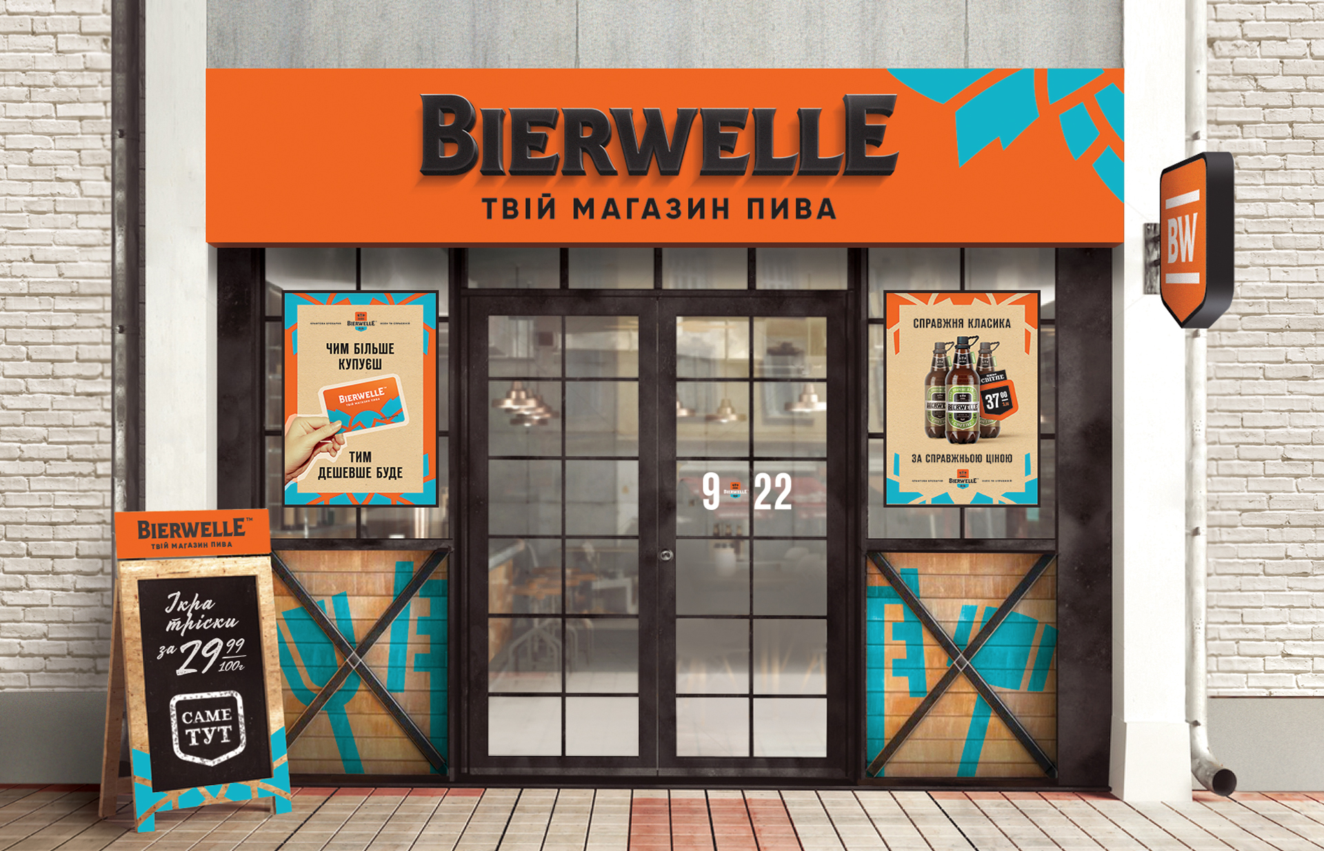
We refreshed the logo and built a system of colours, graphics and applications around it. Orange and turquoise became distinctive accents in the brand’s communications.
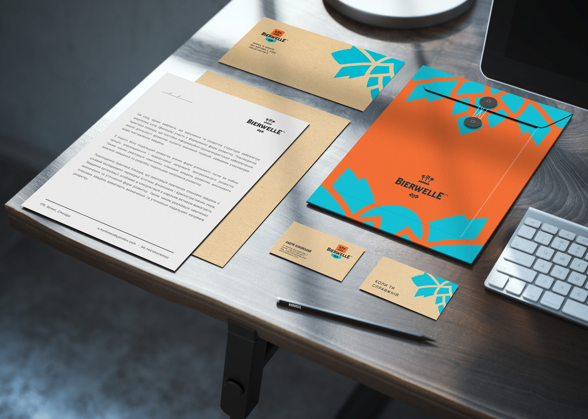
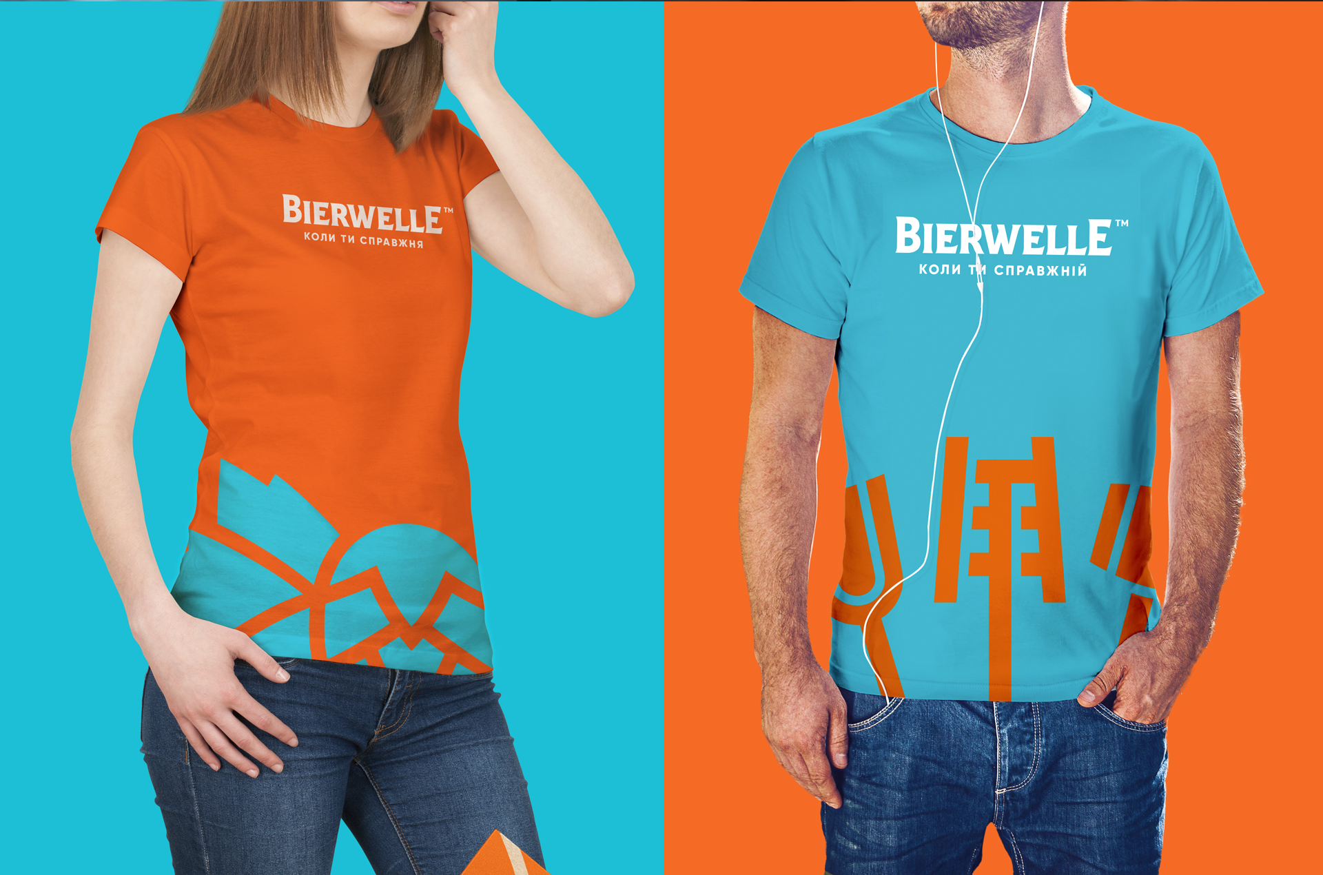
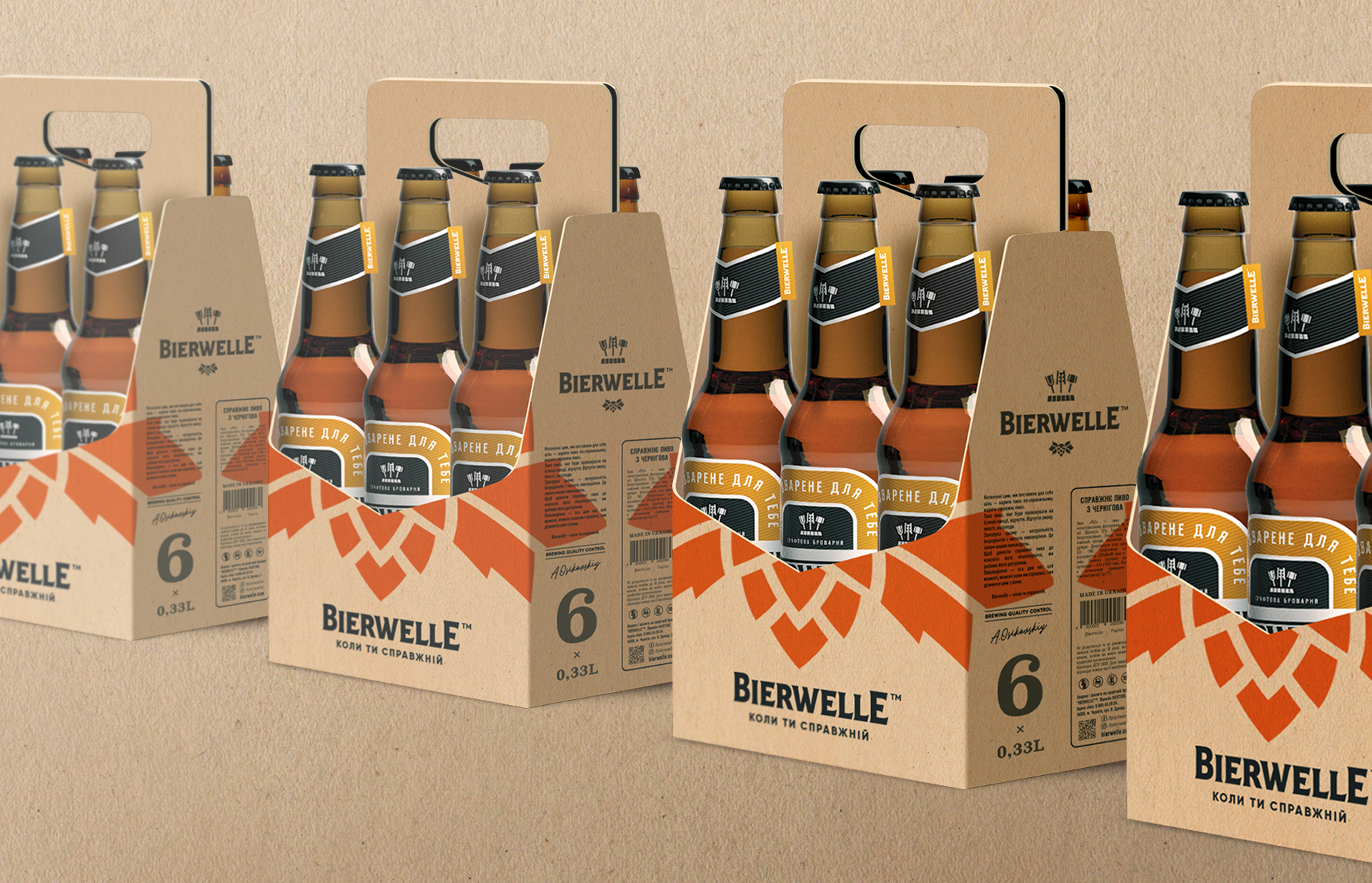
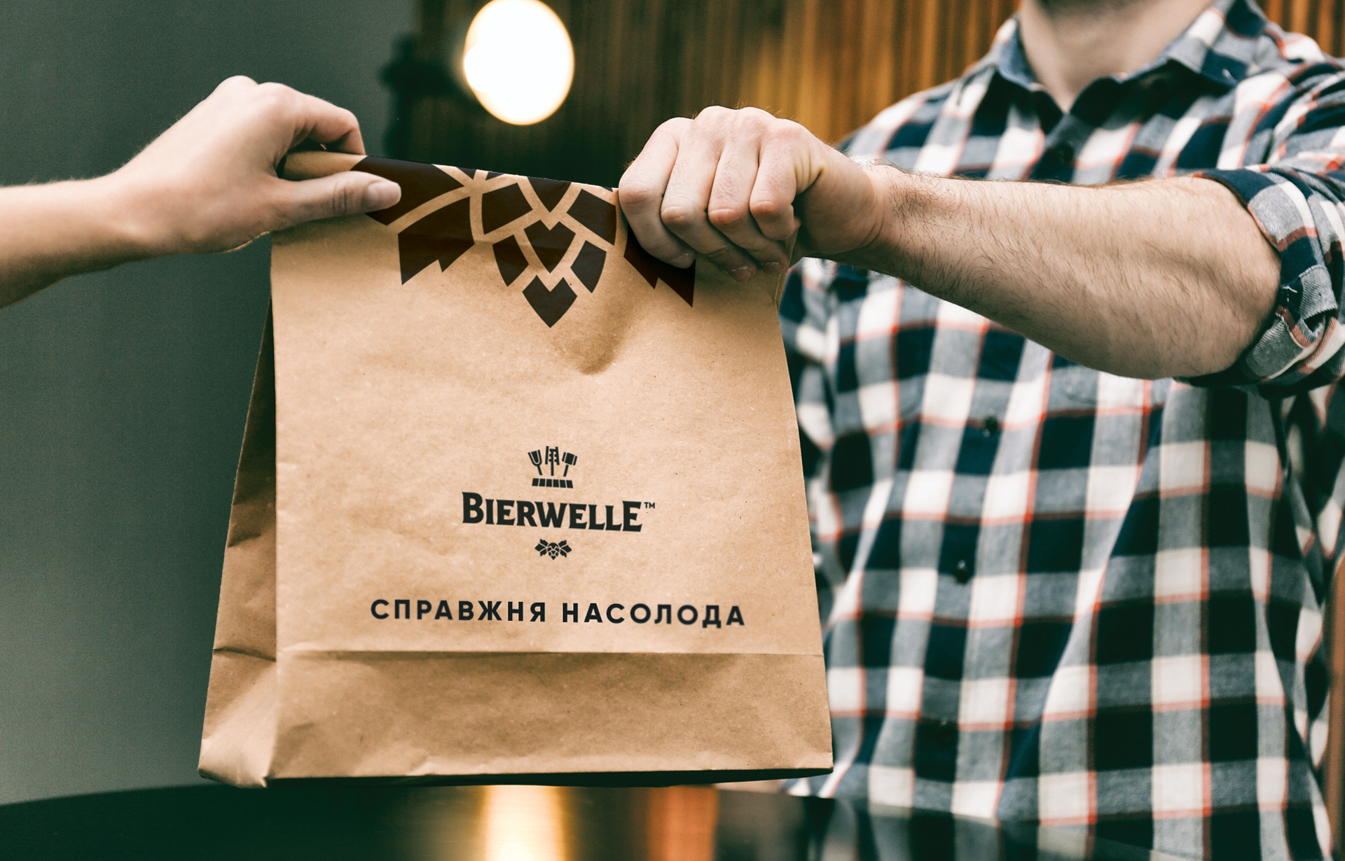
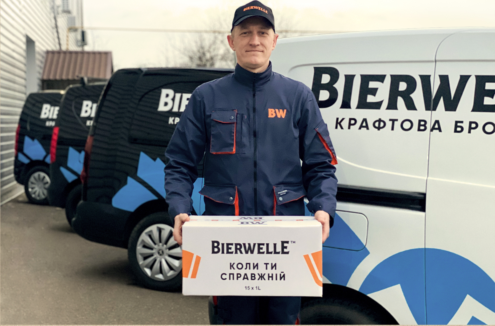
The identity connected labels, packaging, printed materials, team clothing and store design.
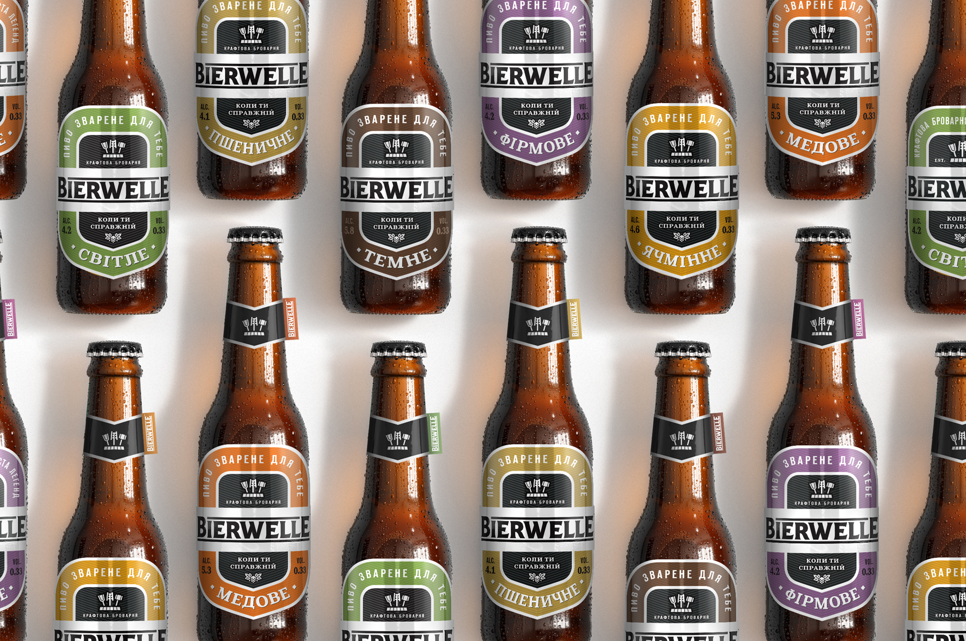
Different beers.
One system.
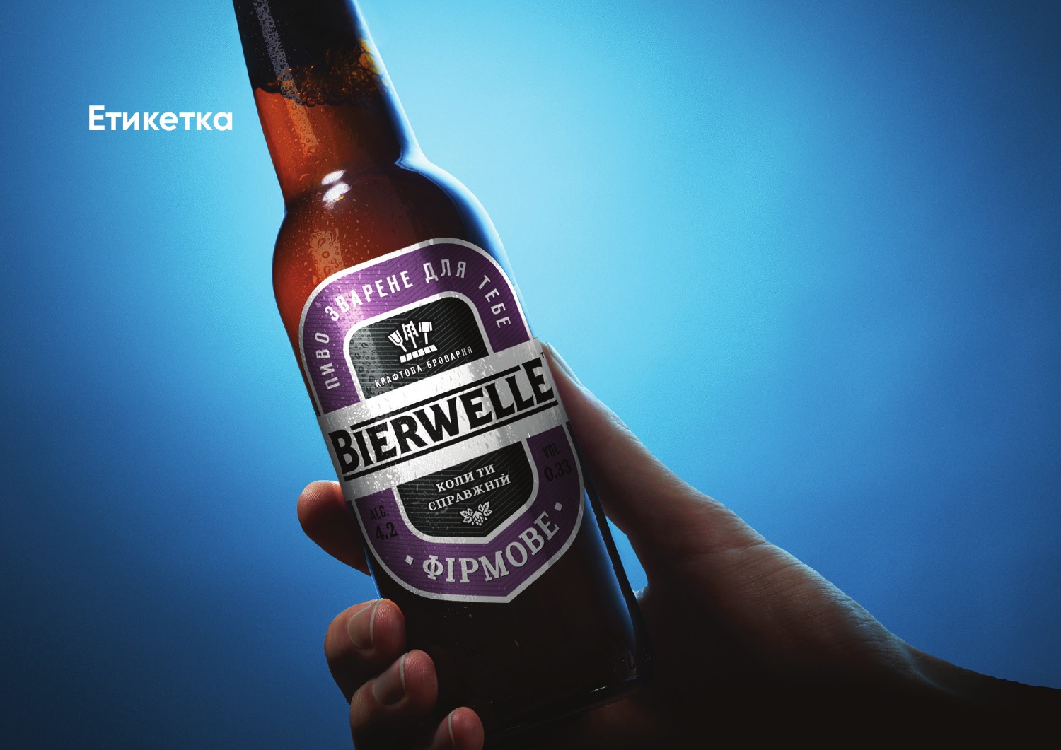
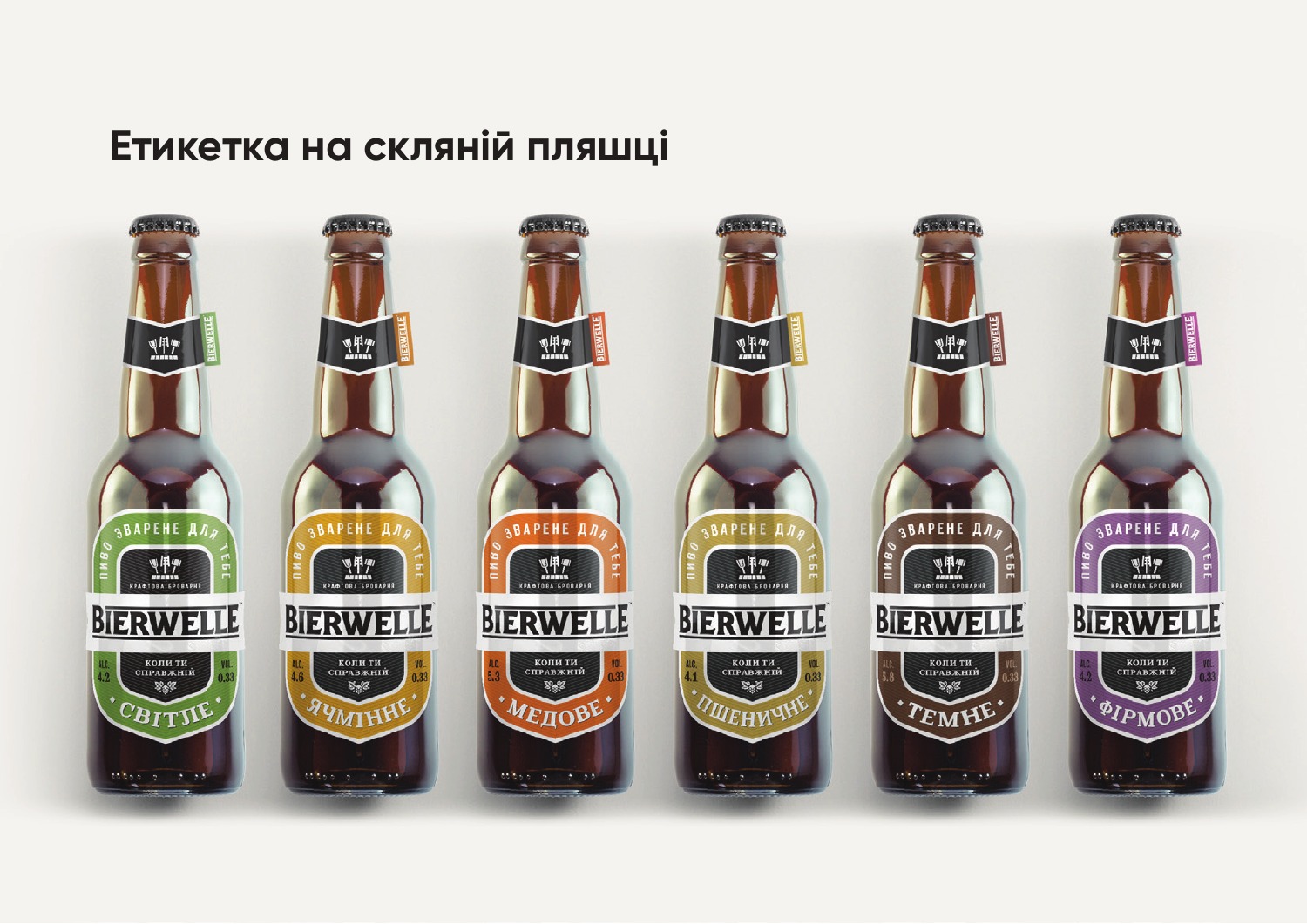
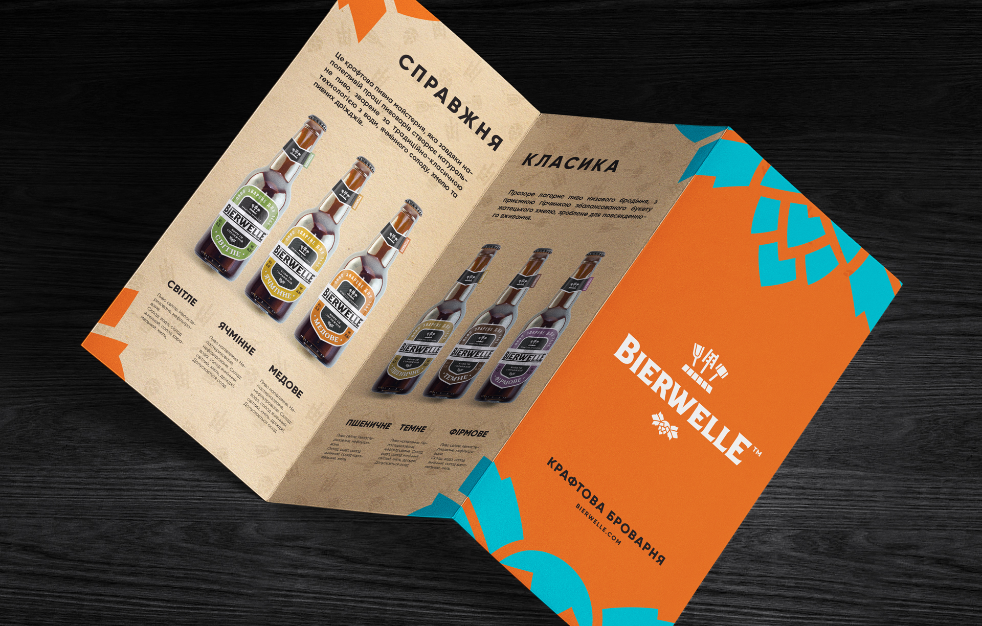
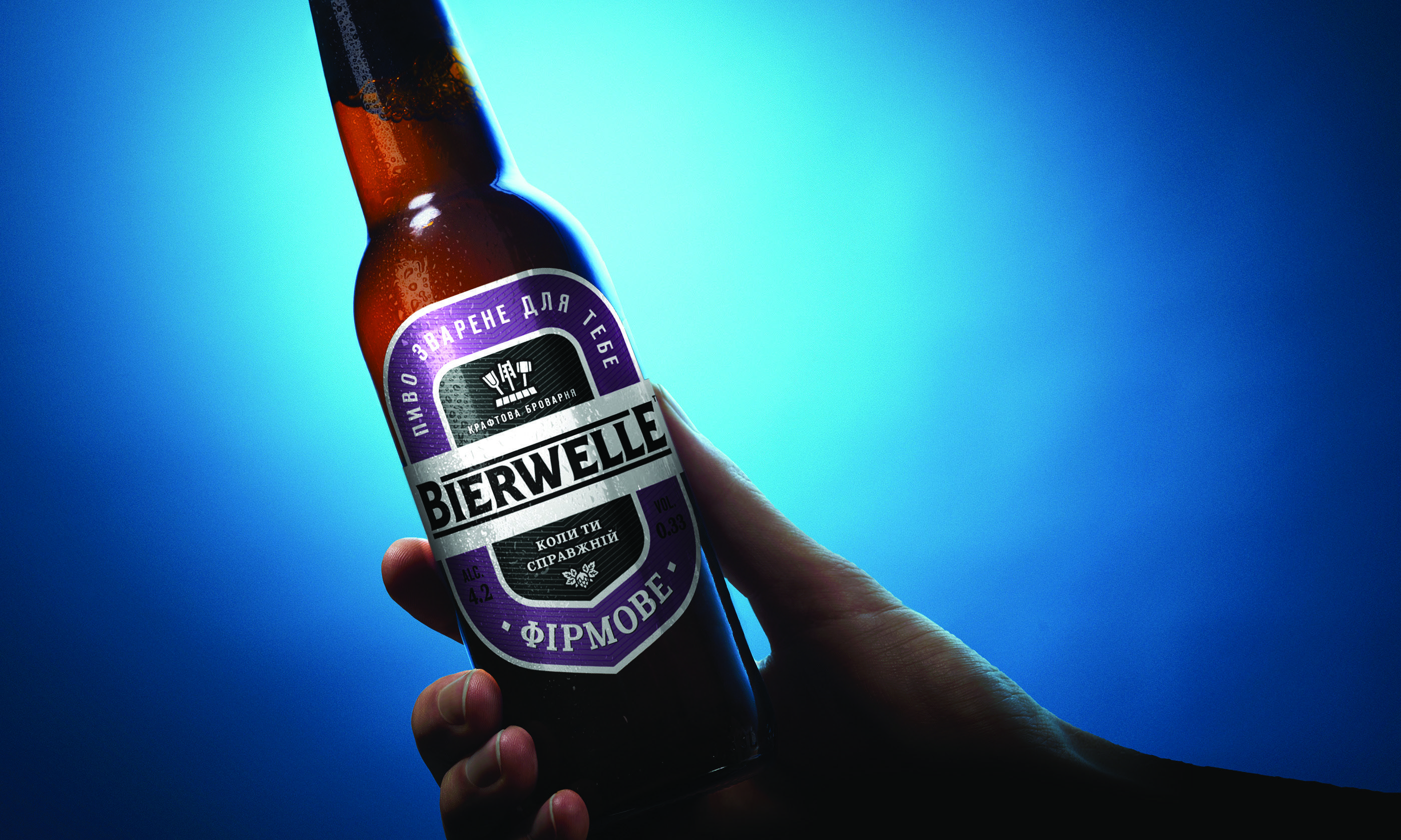
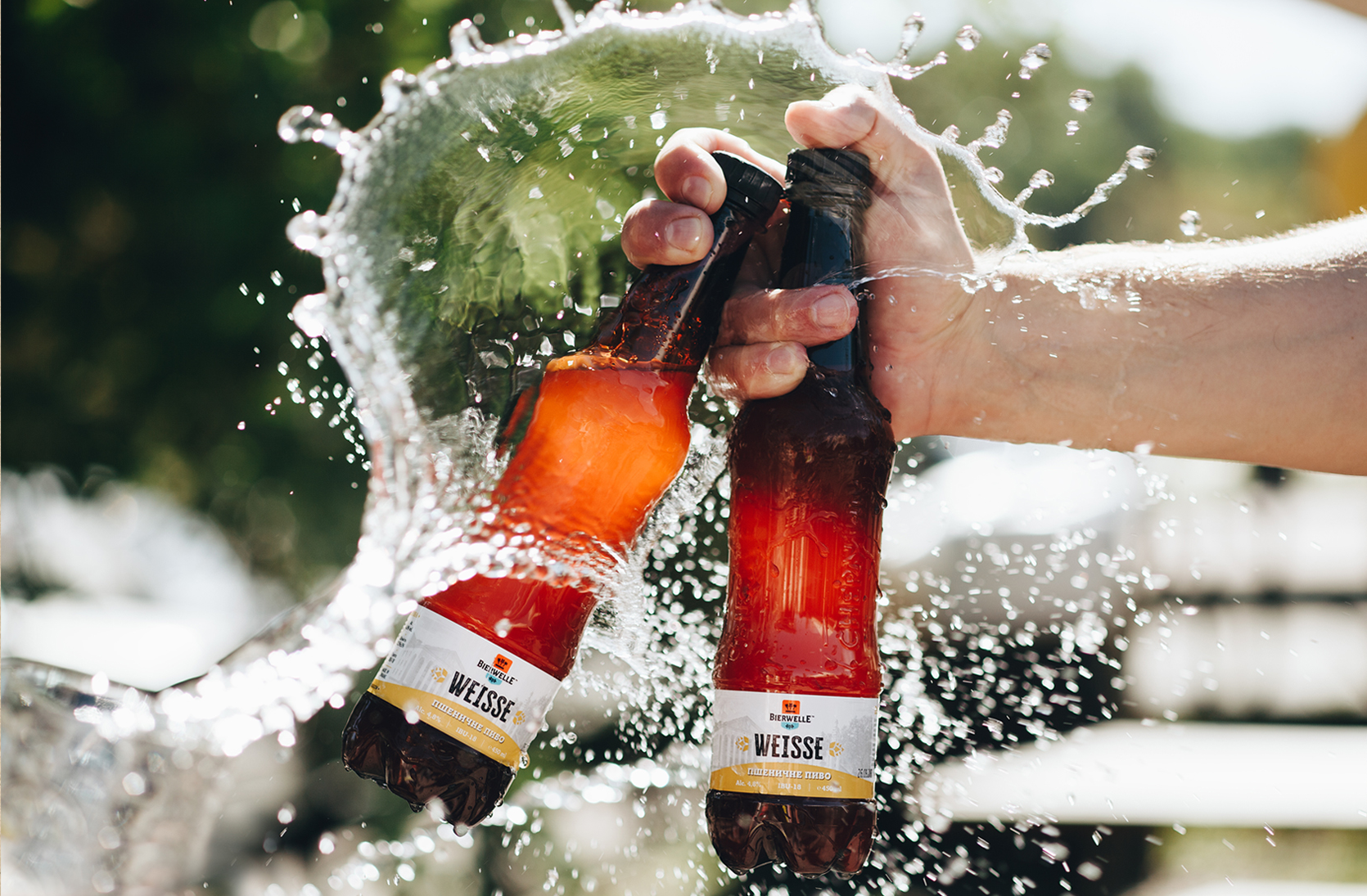
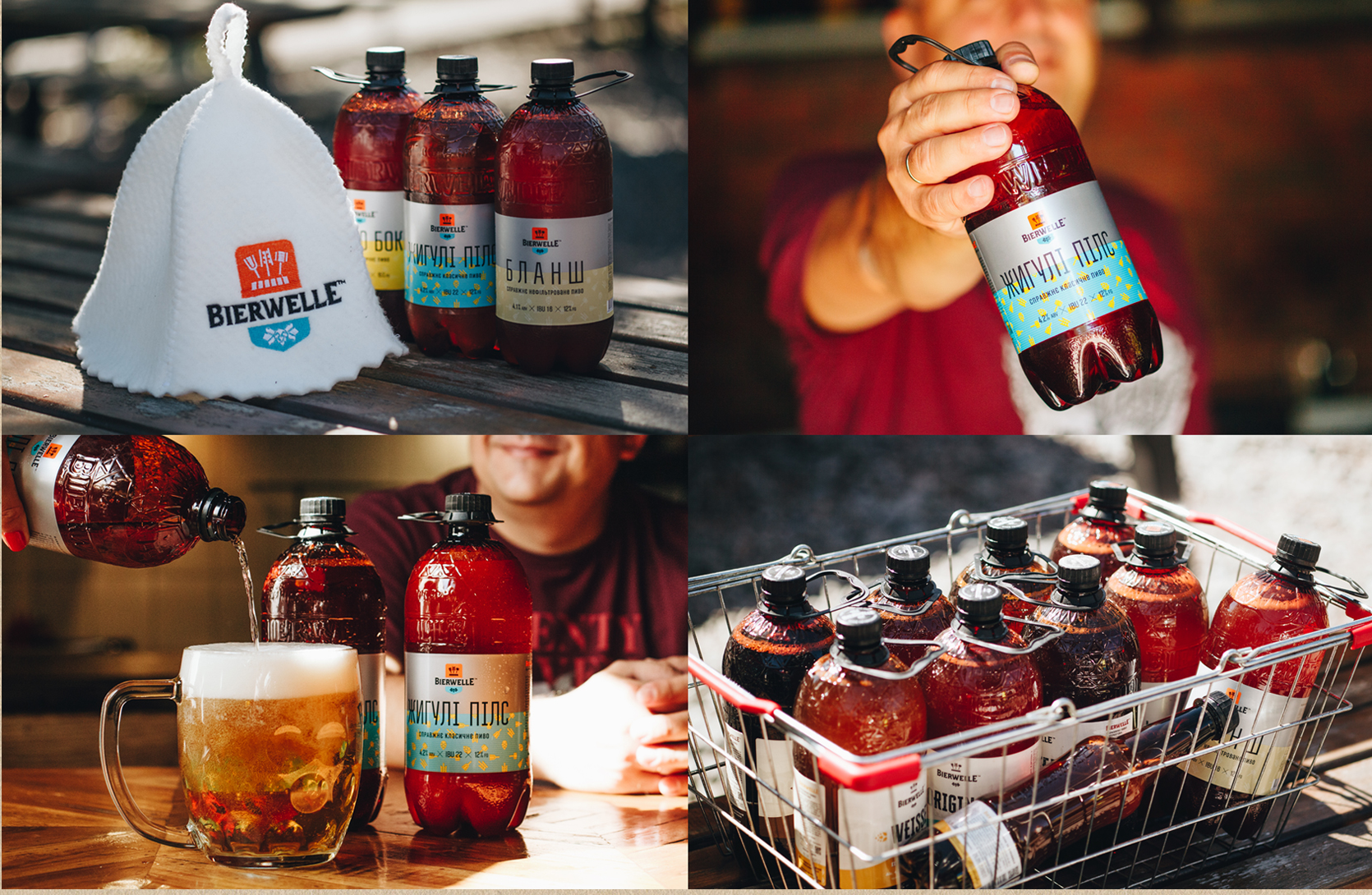
The packaging maintains a unified brewery identity while using colour to distinguish the varieties. The logo, label composition and graphic elements bring the range together.
Beyond
the mockups.
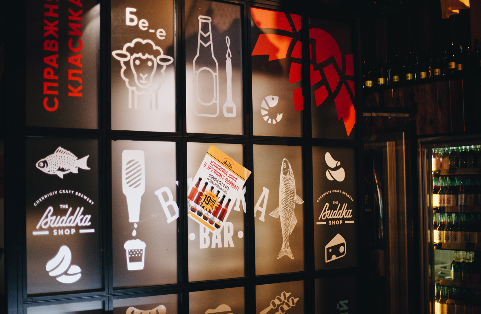
Implementation photographs show the products, team, vehicles and spaces. The visual system works at different scales — from a label to a shop window.
From strategy
to brand guidelines.
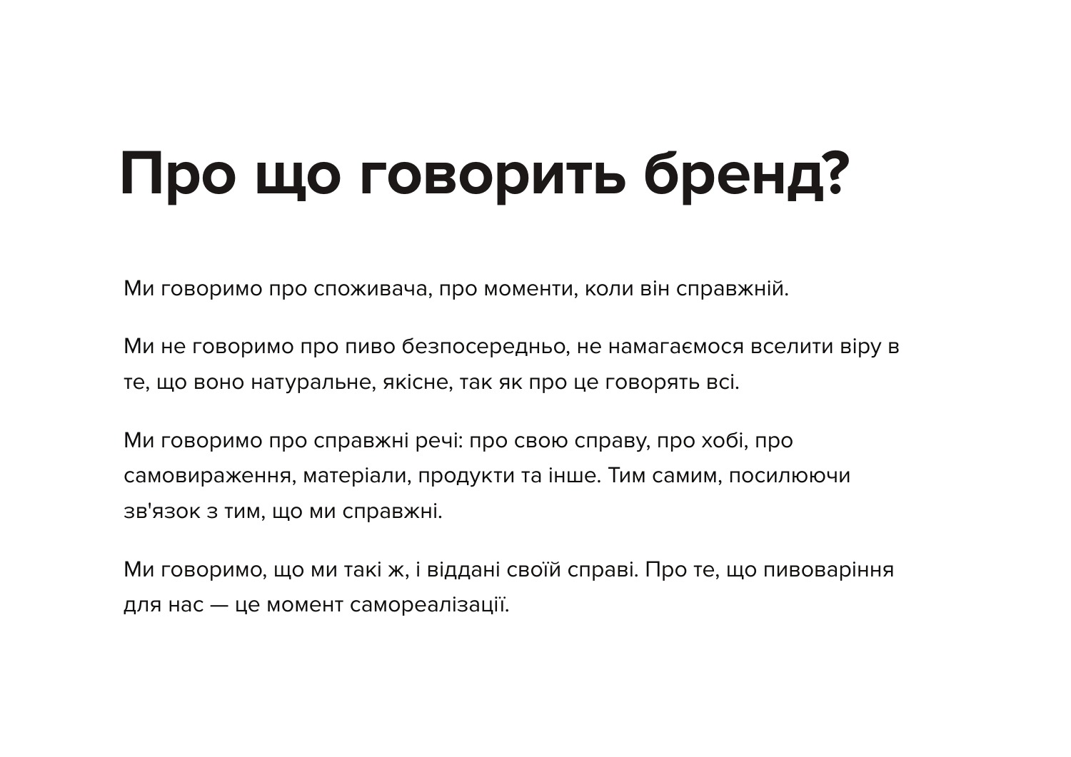
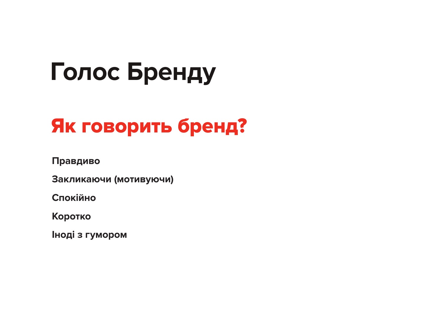
Positioning, tone of voice and the visual system were brought together in one brand book. From messaging to the construction of logos and labels, the team received shared principles for developing the brand.