Mesonia.
Beauty begins
within.
From a founder’s personal label to an independent cosmetics brand: strategy, naming, identity and packaging concept.
2020 · Strategy · Naming · Identity · Packaging
More than
the founder’s name.
The project began with Sonya Duiko cosmetics. The task was to create a brand with the potential to enter international markets, preserving its connection to the founder while giving it a character of its own.
This called for a clear idea, an independent name and a visual system that could unite different products and skincare formats.
First,
understand the person.
We researched the competitive landscape, approaches to skincare and audience expectations. We conducted in-depth interviews with 15 participants, including consumers, cosmetologists and a dermatologist.
A recurring idea emerged: outer beauty is connected to how we feel within and how we care for ourselves every day. It became the foundation of the brand’s positioning.
Brand idea
Beauty begins
within.
Self-love. Self-care. A balance between the inner and outer self.
Beauty begins inside.A new name.
A lasting connection.
Mesonia combines Me and Sonia. It retains a reference to the founder’s name while sounding like a brand in its own right.
The naming concept also evokes the centre and balance, supporting the core idea of harmony between the inner and outer self.
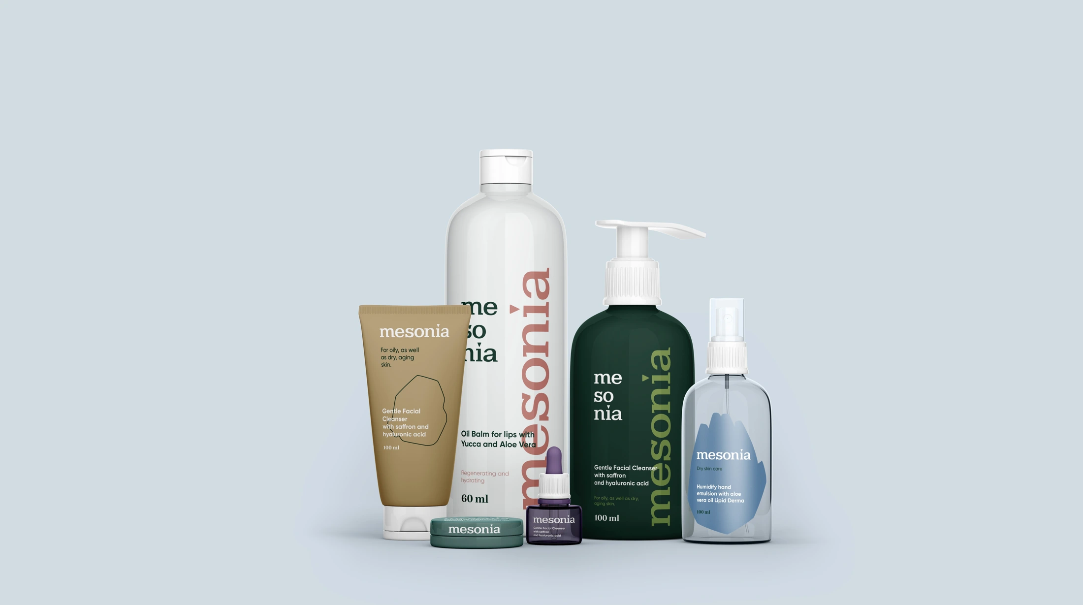
A calm presence.
A distinct character.
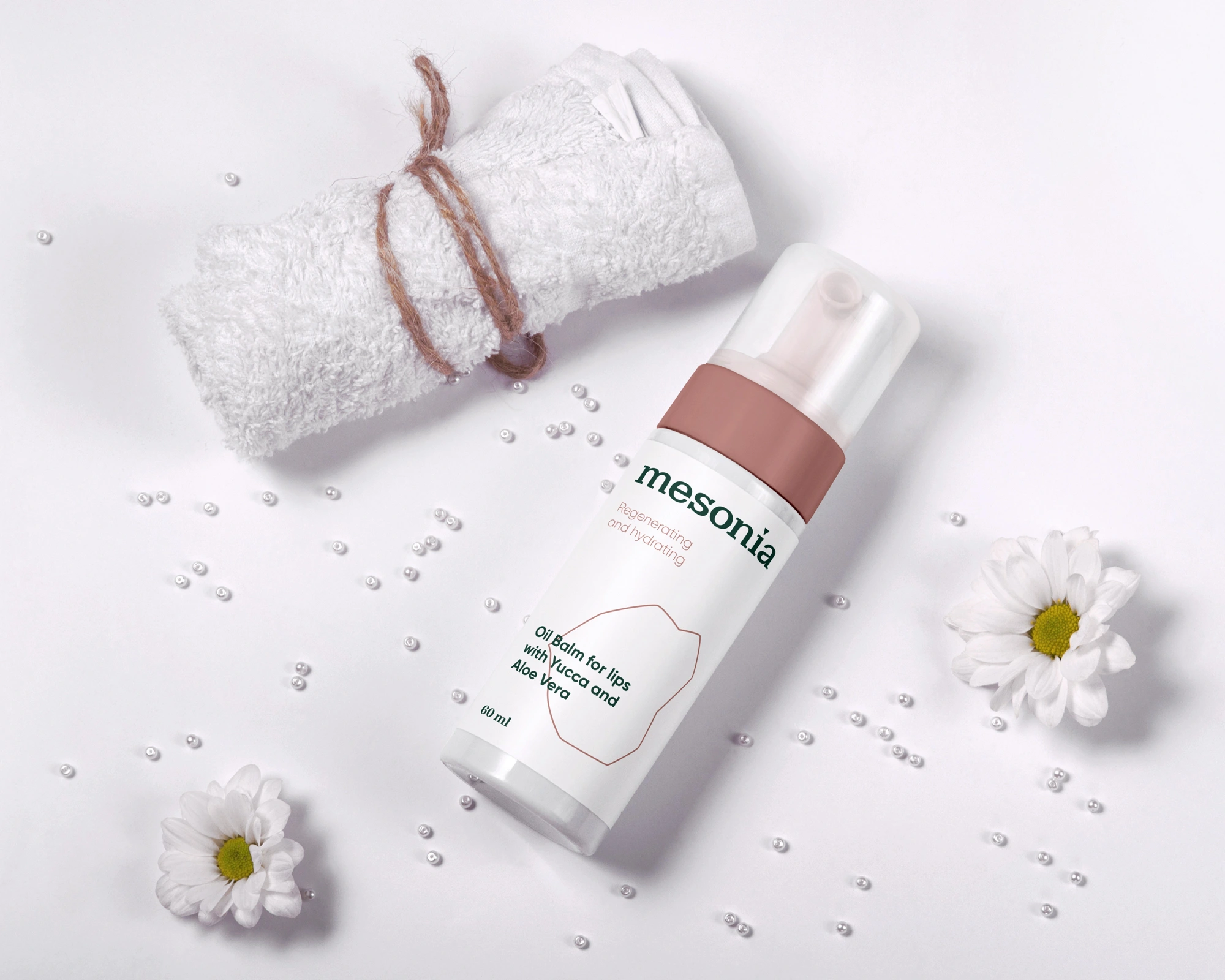
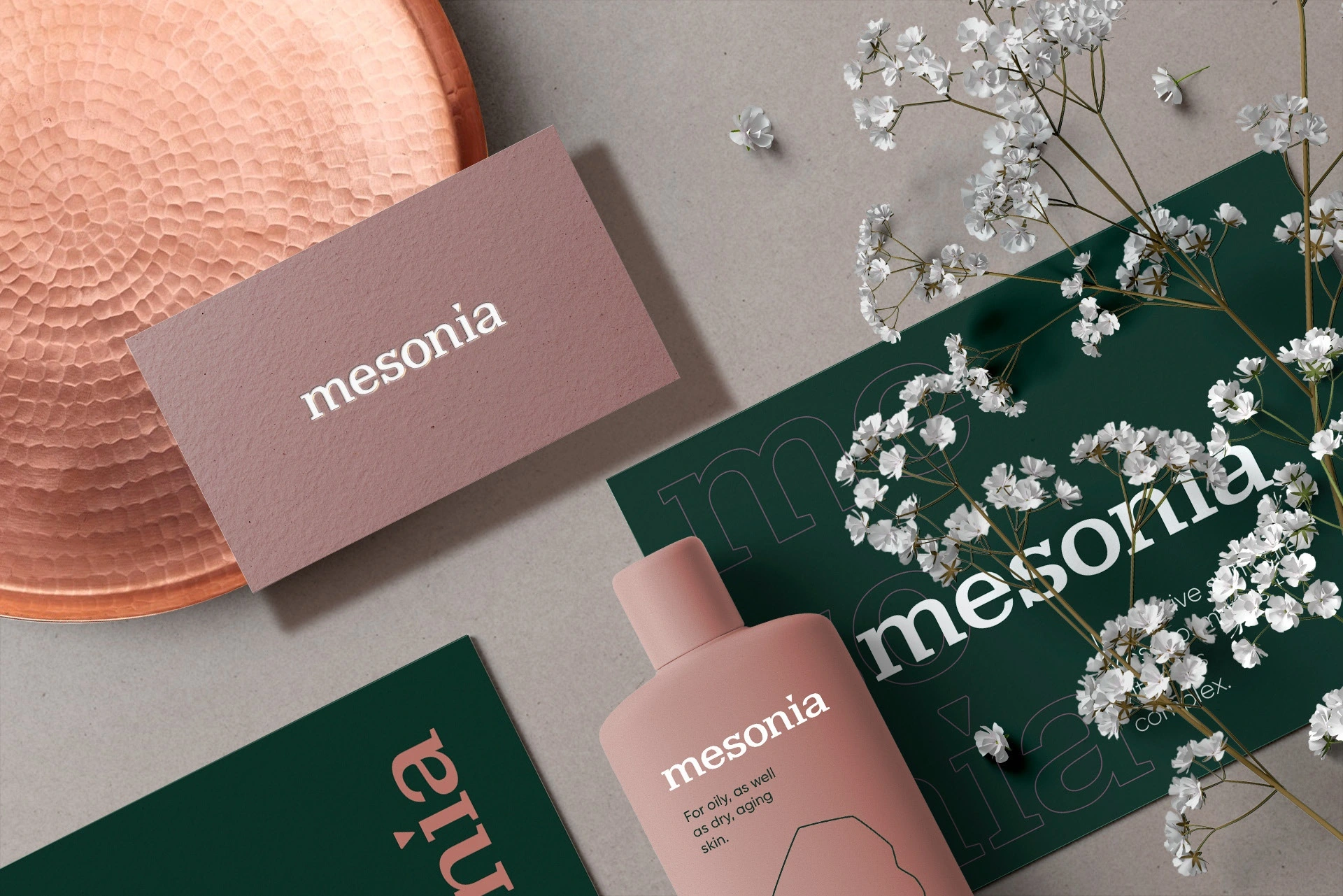
An expressive wordmark, deep green and soft colour accents create a restrained identity. Large lettering and generous space give the packaging a sense of lightness.
We developed design approaches based on product purpose and skin needs. The professional and home ranges share a related visual language.
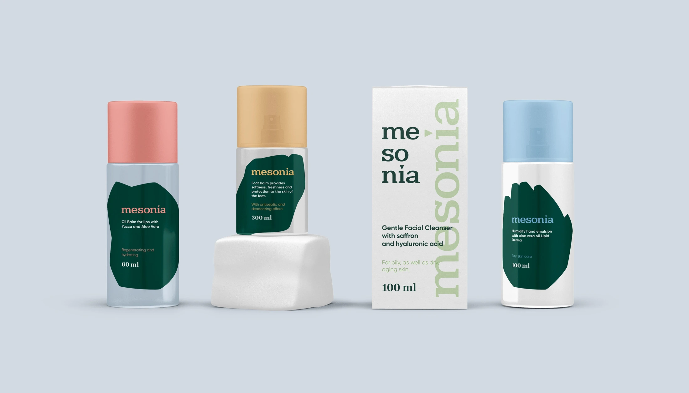
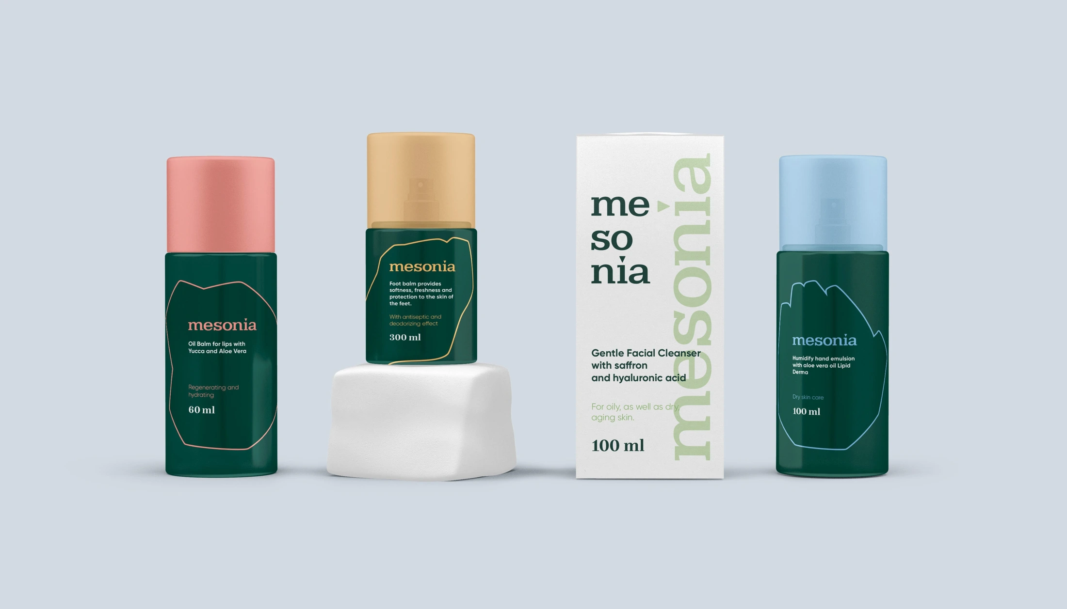
Colour helps
people navigate.
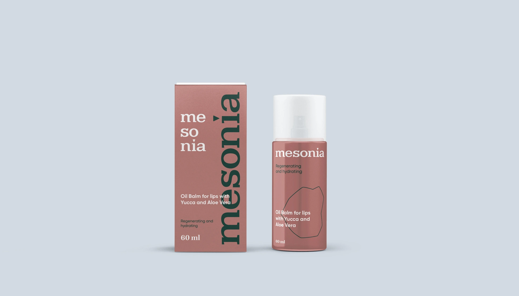
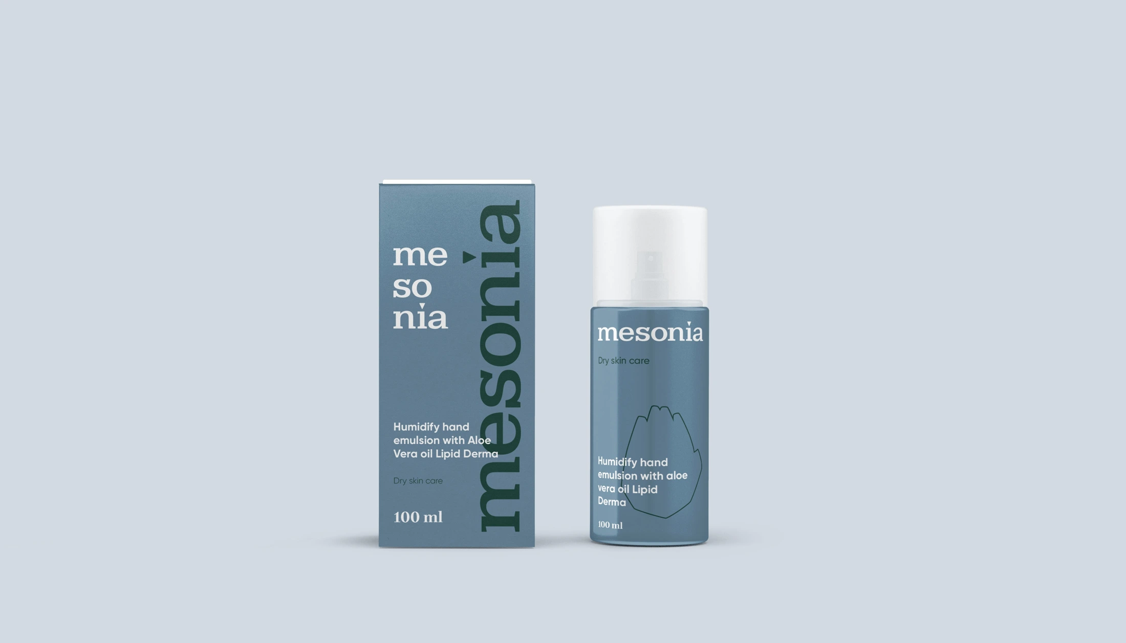
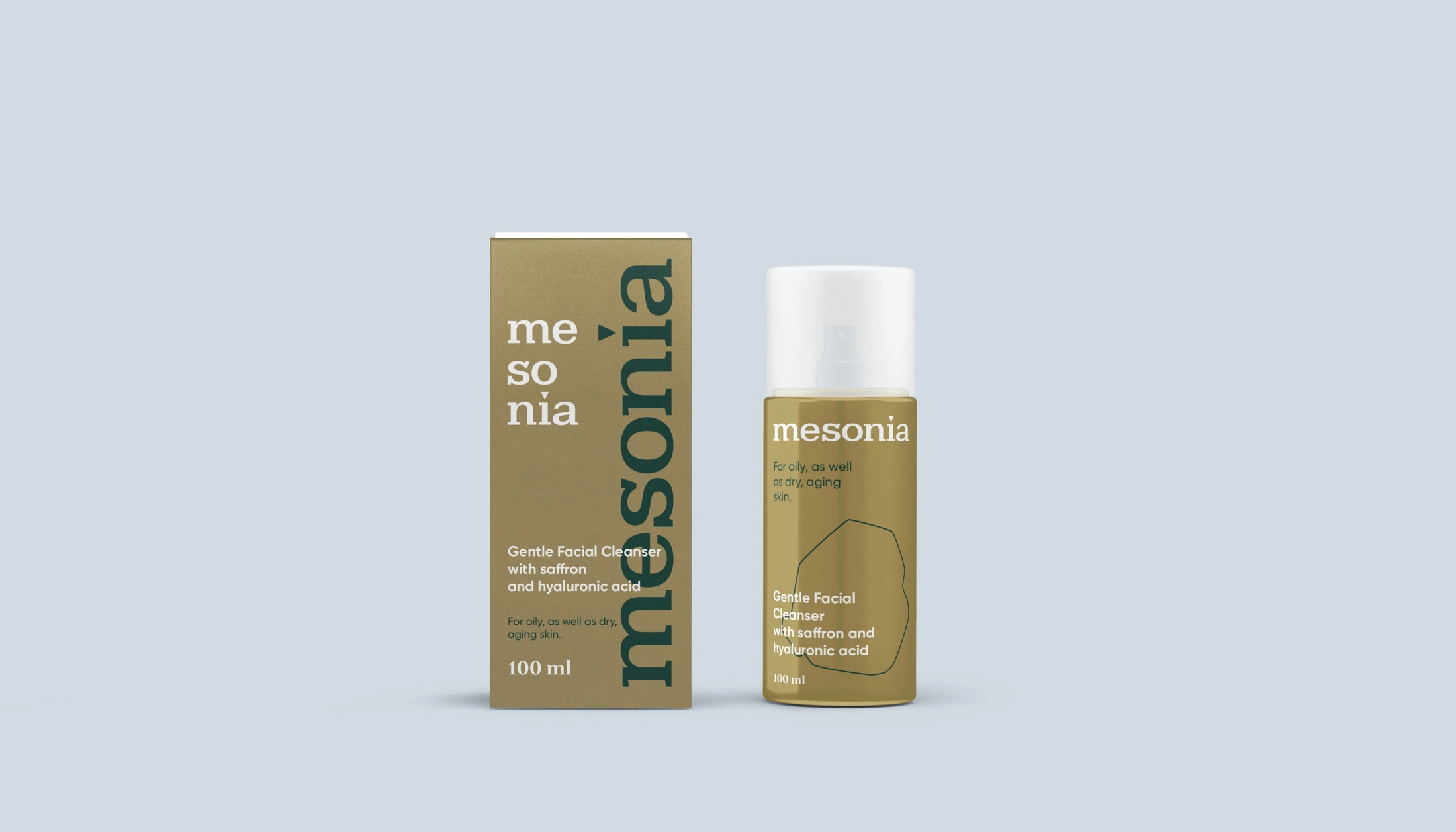
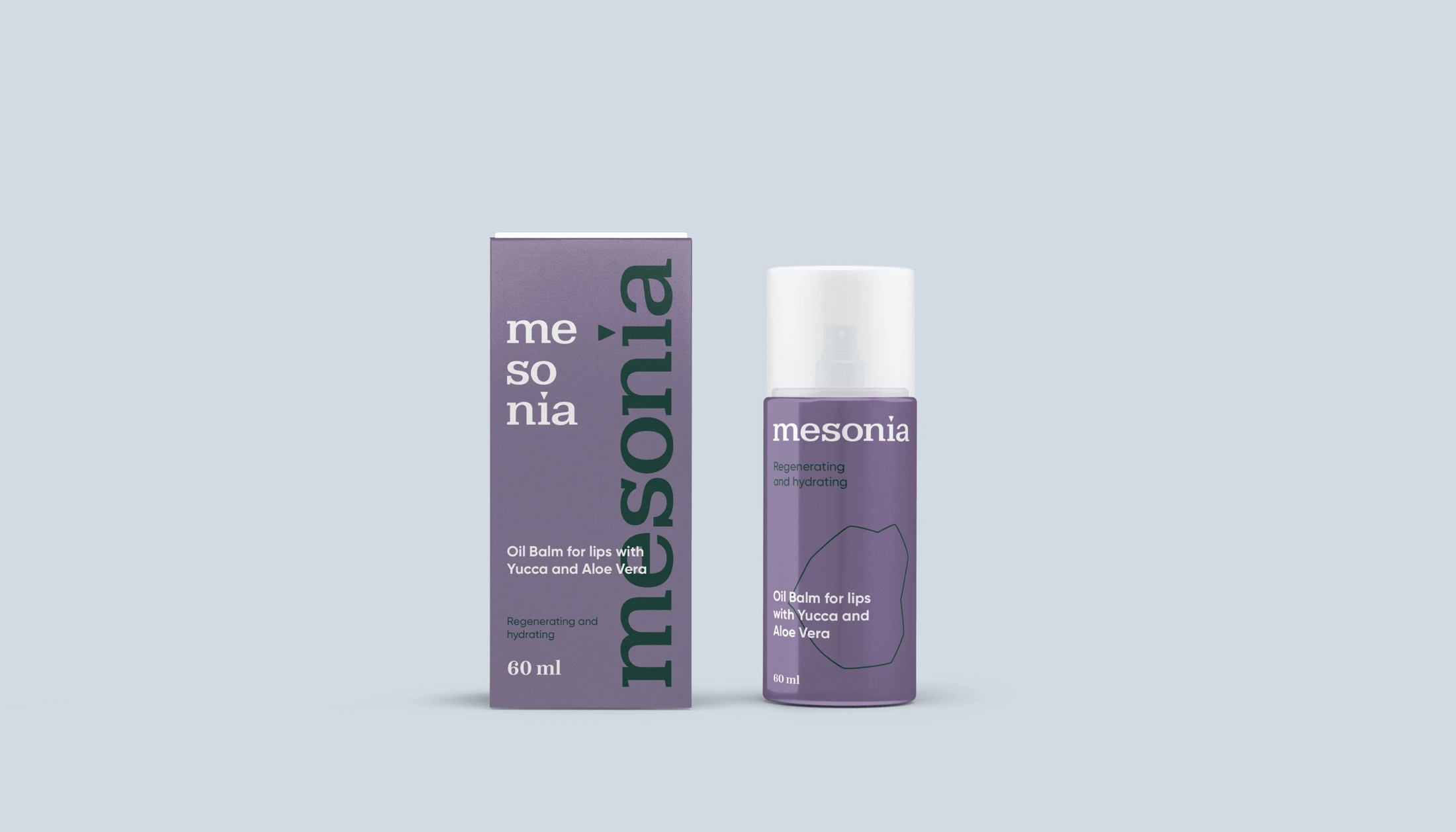
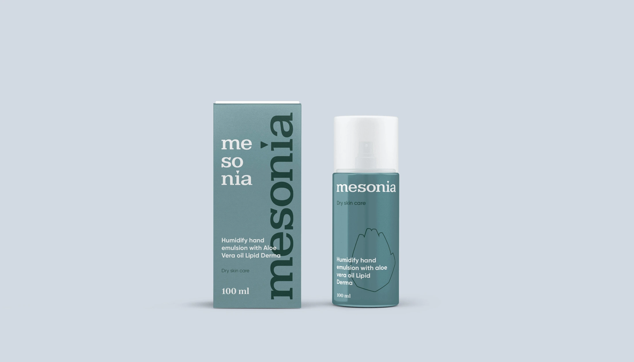
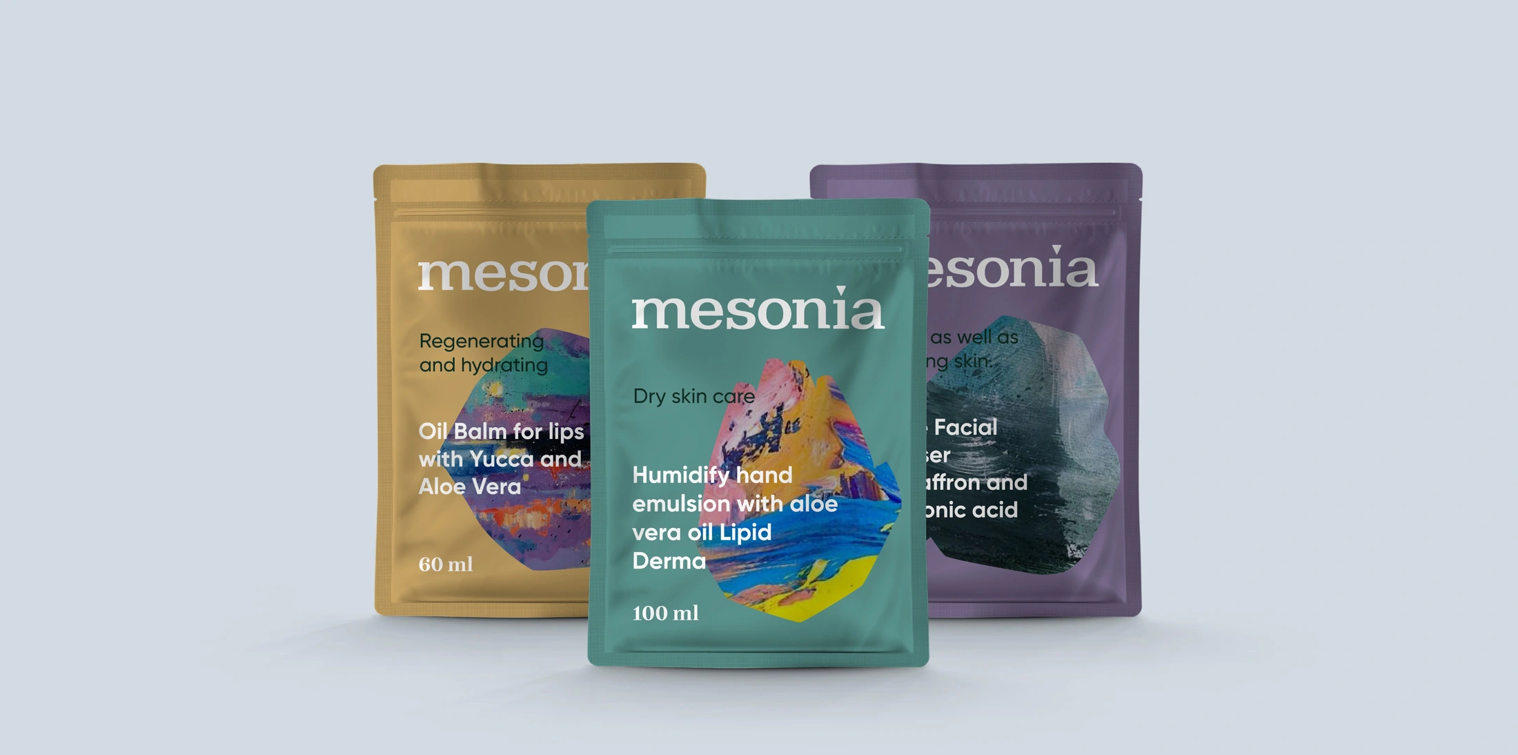
Colour variations distinguish the ranges while a shared composition maintains brand coherence. The logo, product name and volume follow a consistent hierarchy.
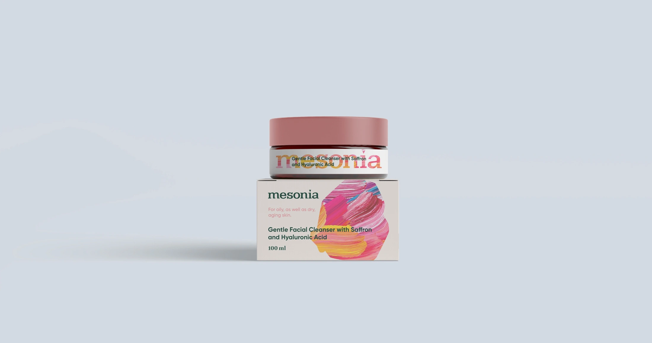
The system allows colour to appear in different ways: on the cap, label, box or across the entire packaging surface.
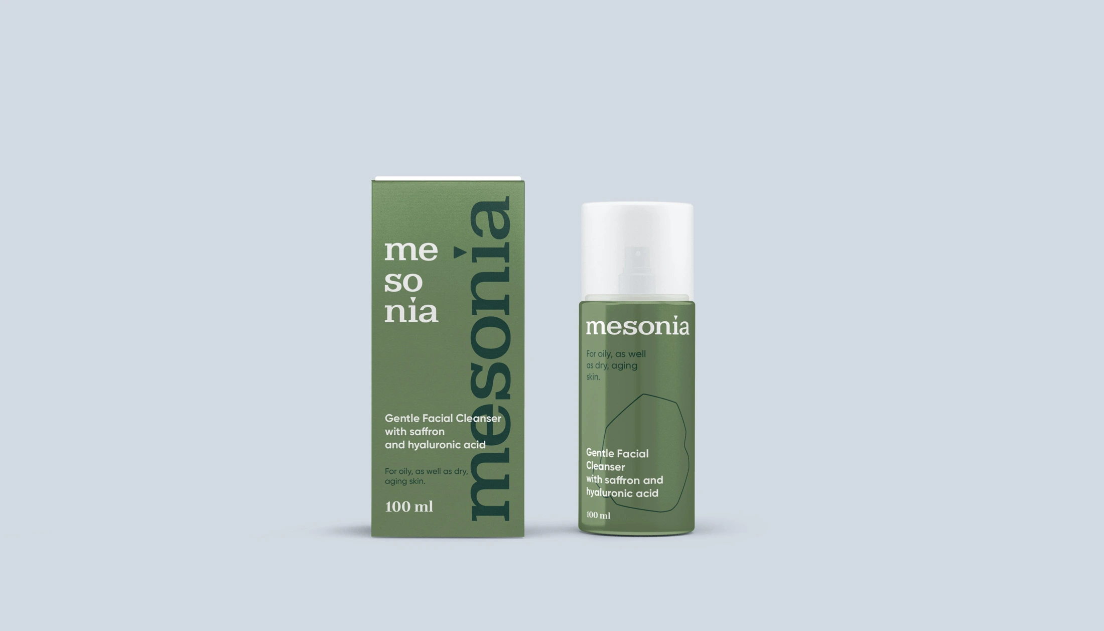
From a single product
to a skincare ritual.
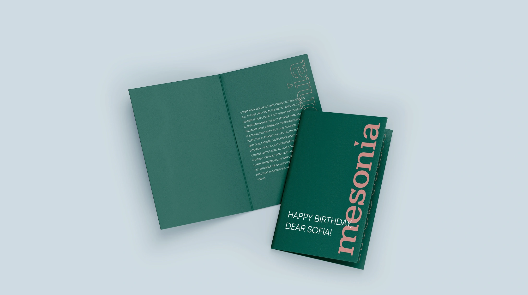
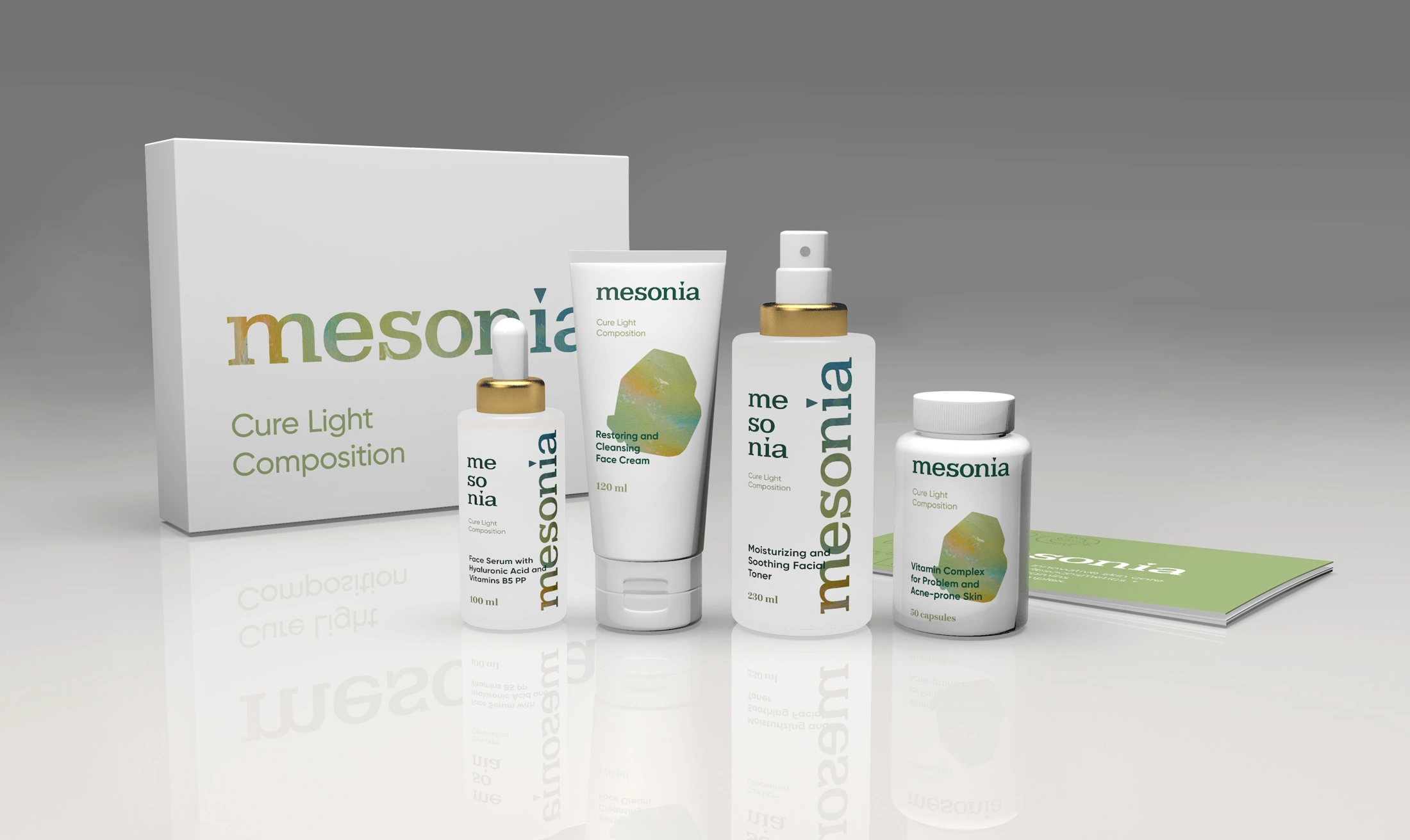
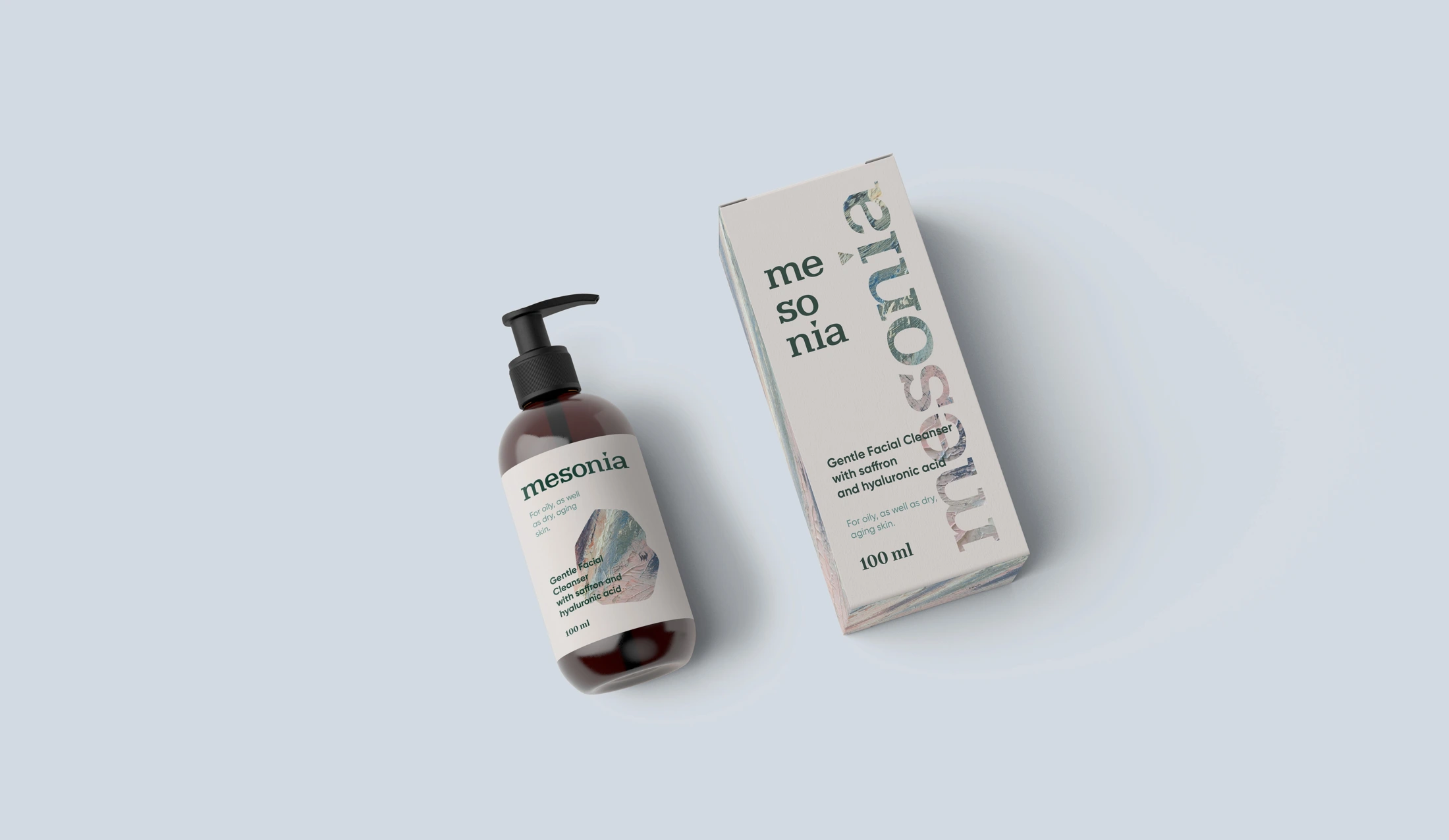
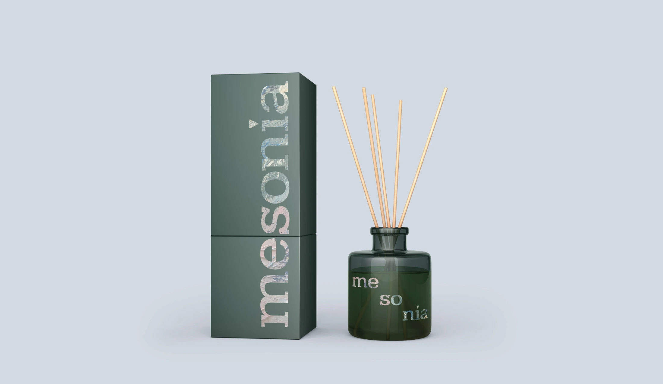
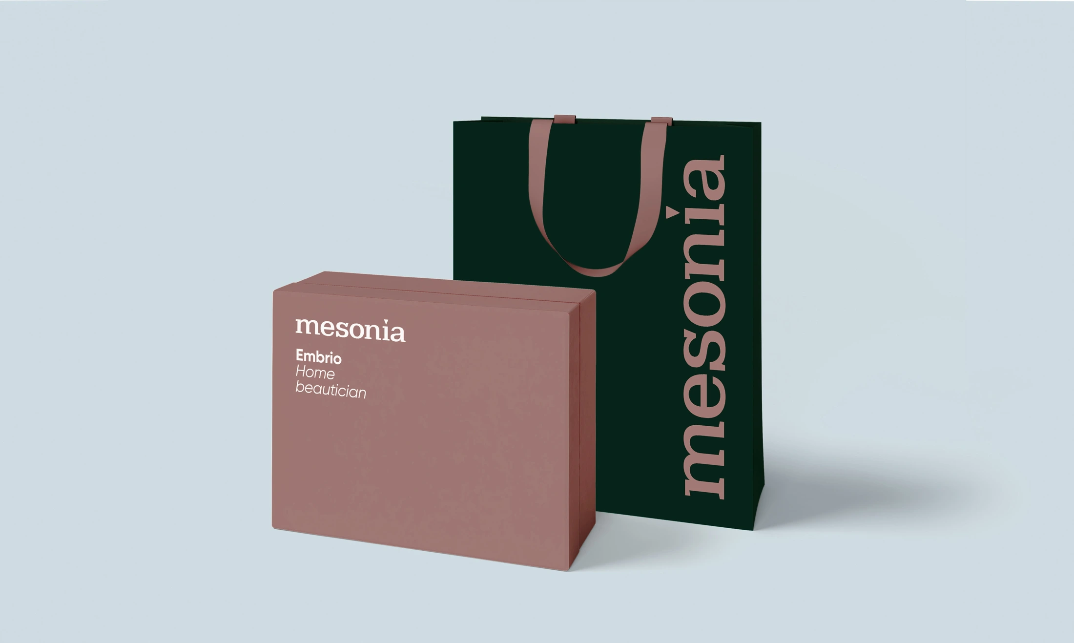
The concept covered bottles, jars, pouches, sets and supporting materials. Gift formats included boxes, bags and cards — objects that make the brand experience feel complete.
A separate direction explored ‘compositions’: sets of products brought together around a particular need. These received their own expression within the wider system.
The brand continues
in the details.
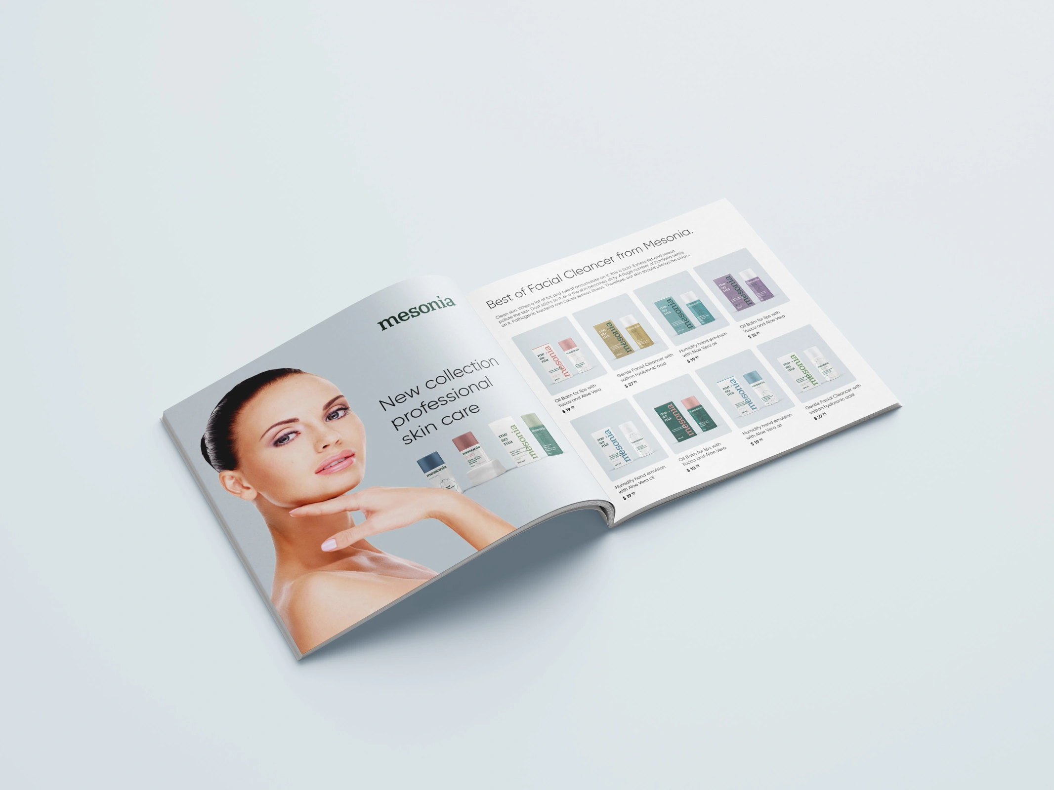
The visual system extended to catalogues, cards and gift sets. Every application carries the same tone: attentive, calm and personal.
The work resulted in a strategic and visual brand concept, from a new name and positioning to principles for product range design and communications.